There was a murder in our beautiful sleepy little suburb last week! Just awful and my heart goes out to the family and friends of the lovely family this has affected 💟
It got me thinking about security doors and the fact that many home owners won’t have one because of the (usually ugly) aesthetics.
As much as we all want our front doors to make a statement and be a beautiful feature of our homes, the reality is that security is just as important. And while it’s true that security screens can be unsightly, there are options available that can blend in with the style of your home and provide the protection you need without sacrificing on looks.
First and foremost, it’s important to consider the purpose of a security door. While they may not be the most attractive feature of a home, they serve a vital purpose – to protect you and your family from burglaries and intrusions. Don’t skimp on security just because you don’t want to cover up your beautiful front door. Instead, focus on ways to highlight and showcase your front entrance without relying on the door itself.
For example, you could consider adding a feature wall or a portico above the entrance to add dimension and depth and detract from the door a bit. Or, you could incorporate elements that nod to the era in which your home was built. Another way to add a welcoming feeling is to add plants at the front door. I’m a fan of various oversized pots grouped in 3’s if you have the space. Lighting is also an excellent way to add small pops of interest. Even during the daytime, your light fixtures can make your front entrance look interesting.
When it comes to choosing a security screen, there are options available that can blend in with the style of your home. Rather than choosing a plain, utilitarian screen, look for options that incorporate design elements that match the rest of your home. OR go for a plain screen and play up the surrounding surfaces.
Ultimately, the most important thing is to prioritize security while still finding ways to make your front entrance a welcoming and attractive feature of your home. Don’t waste money on an expensive front door if you’re going to cover it up with a security screen – focus on other ways to highlight your entrance and make it a standout feature of your home.
Jane Eyles-Bennett x
To render or not to render is one of the biggest decisions facing renovators of brick homes.
On the surface, the pros and cons appear to be fairly straightforward. On the plus side, rendering can cover old-fashioned bricks and freshen up the facade. However, on the negative, there is always maintenance to be done because render tends to crack and deteriorate over time.
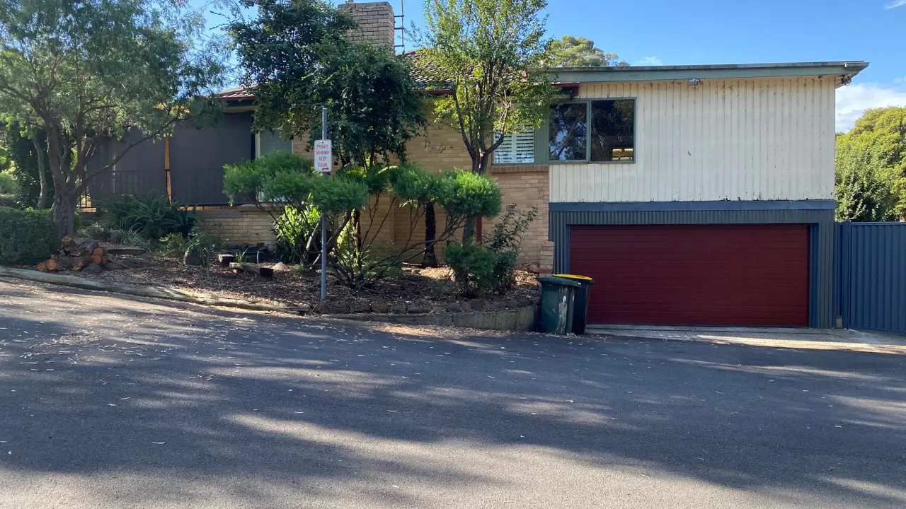
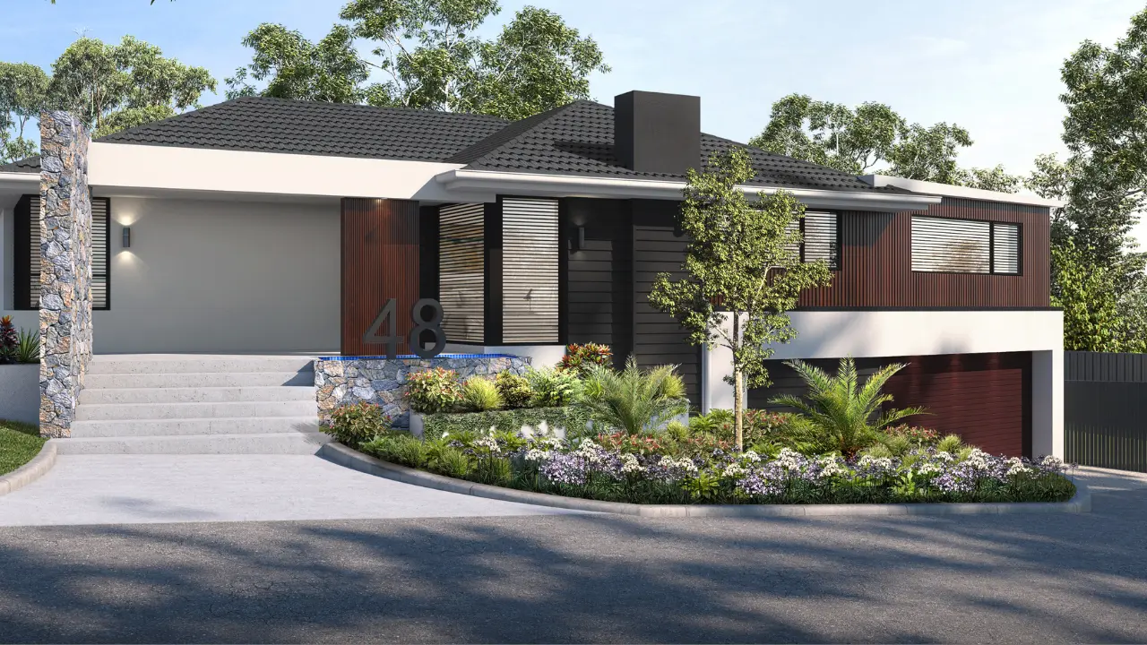
But as a professional house facade designer here in Australia, I can share that it’s usually not as cut and dried as that. Rendering won’t deliver the beautiful facade you’re hoping for without actually assessing what else is wrong with the facade. Have you ever seen a brick house you like? Probably! So then, it’s likely not just the bricks that are the problem here. There are other factors at play. Below is an example of one brick home I redesigned for a client. For more examples and inspiration, visit https://hotspaceconsultants.com/gallery/
Typically, a renovator will render a blocky 1970s, ’80s or ’90s brick home and not do anything else. Even if they have gone one step further and painted the gutters and front door, or done the garden up a bit, it still ends up looking like the same house, just in a different colour.
In part, this is because older style brick houses have those skinny windows, often in bronze or silver-anodised finish or cream powder-coated. This window style usually gives the house quite a flat appearance.
When the house is rendered (even if the windows are repainted), the entire facade becomes one featureless surface with little that adds interest or appeal.
To really give a home a designer-style makeover, begin by determining what aspects of the home aren’t working.
It may not be all the bricks’ fault. For example, a lot of older brick houses don’t have a clear focal point at the front. A good facade design can fix this by incorporating elements that will emphasise the front entrance so that the eye is naturally drawn towards the front door.
Consider adding a feature wall or a portico or some sort of roof structure above the entrance so that the entrance gains some dimension, depth and focus.
The most common reason for rendering is to cover up old-fashioned or unattractive bricks. The downside is that while rendering might give the house a better colour, you lose the visual interest that the mortar lines and texture of the bricks bring.
With a bit of creativity and planning, you can add this texture and interest back into the look of the house by adding some other elements. You might even retain some of the bricks and integrate them into your facade design.
However you choose to update your house, it pays to be respectful of its heritage (yes, even if it’s a ’70s or ’80s box). You can still achieve a more modern design, but incorporate some elements that give a nod to the era the house was built in.
For example, you might incorporate door handles from that era or add a timber feature that is both modern and reflective of that time period. It’s not about compromising on a modern look, but about blending the old with the modern to achieve a new one.
Achieving a great facade for an older brick home requires more than just updating the windows, choosing a nice colour for the render and overhauling the garden.
It’s about introducing new materials and combinations of materials in such a way that they transform an otherwise flat and featureless house into something with texture, depth and visual interest.
Jane Eyles-Bennett x
https://hotspaceconsultants.com/.

If you’re considering updating the outside of your home, you might be thinking about cladding or re-cladding some or all of the exterior. Cladding plays a big role in the overall appearance of your home, so it’s important to choose a material that not only looks good, but is also durable and suited to your local climate. Here are the most important factors I consider as an exterior designer.
Scale and shape of your home:
If your home is large, then aesthetically you can afford to use a larger scale of cladding. However, if your home is smaller or low set, or if it has lots of windows (and therefore less wall space), then a smaller scale/pattern cladding could be a better choice.
Appearance:
The appearance/design of your cladding is a critical factor. Not only the texture or scale, but also the colour and finish. Choose a material that complements the overall style of your home and fits in with the surrounding neighborhood. There are many options to choose from, so have a look online for inspiration.
Maintenance:
Different types of cladding require different levels of maintenance. For example, timber cladding will require regular painting or staining to keep it looking fresh, while brick or stone cladding may require minimal maintenance. Consider how much time and effort you’re willing to put into maintaining your cladding when making your decision. Luckily there are plenty of ‘faux’ options out there these days, including composite ‘timber’ products, stainless-steel wall tiles, aluminium pre-oxidized copper and everything in between!
Climate:
The type of cladding you choose will depend in part on the climate in your area. For example, if you live in a hot and dry climate, you’ll want to choose a material that is resistant to heat and UV radiation. On the other hand, if you live in a cooler, wetter climate, you’ll want to choose a material that can withstand rain and wind.
Cost:
The cost of different cladding materials can vary significantly, so it’s important to consider your budget when making your decision. Some options, such as brick, stone, composite or aluminium can be more expensive upfront, but may have longer lifespans and require less maintenance in the long run. Others, such as real timber or other cheap cladding solutions, may be more affordable up front, but need more maintenance so as not to rot, bow or fade over the long term.
When it comes to choosing cladding for your home here in Australia, there are many factors to consider. By taking the time to research your options and think about your specific needs and preferences, you can make an informed decision that will give you the look you want and the durability you need.
Conclusion
In conclusion, choosing the right cladding for your home is key to achieving a stylish and durable exterior. From aesthetics to functionality, carefully consider your options to enhance both the appearance and value of your home. With the right choice, your house facade will make a lasting impression.
Jane Eyles-Bennett x
P.S. Want to receive our latest and coolest Before and After’s straight to your inbox? Enter your details here and I’ll keep you in the loop!
Planning a reno with young children around? Here are a few tricks!
PLANNING
With kids in the picture you’ll want your make-over done as quickly as possible, so avoid delays by planning ahead. Articulate exactly what the reno will entail, including what you are altering, removing and leaving alone. Decide on paint colours, tiles/pavers, lighting, landscaping and every other product you are going to be using so there is no delay once you have started. Depending on how big your make-over or renovation is going to be, this could be a very long list! Be gentle on yourself and don’t expect to complete your entire exterior in a few weeks. If you need a step-by-step for selecting colours and working out your overall renovation plan, check out my course (Google ‘Street Appeal Academy’) or click here.
TRADIES
Get quotes from trades and let them know up front what your expectations are. For example, you might insist there is no smoking, drinking or bad language on site, and they must arrive after a certain time so you can get the kids up and ready before they arrive. Specify if you want them to clean up after themselves – some will charge a bit more for this, but it’s worth it to keep the kids safe and your sanity intact. Choose tradies that are good, fast and reliable. Never sacrifice quality for cost. As a professional exterior designer, I can’t stress this enough! Do less to your home rather than compromise on product or labour quality.
PRE-BOOK YOUR CONTRACTORS
Do a timeline of what needs to happen, when. Estimate how long each component is going to take and try to minimise the downtime in between so that you have one trade in directly after the other. This can be a tricky task, so ask someone who is experienced if you need to. It’s a case of you don’t know what you don’t know sometimes – so employing someone who’s around renovations regularly is a better bet than trying to work it out yourself.
KID-FREE ZONE
Have a kid-free zone where you can store paint, chemicals, equipment and products needed for the reno. Seal it off as much as possible so the kids can’t get in! Put up a kiddie gate blocking access if necessary (or make sure the space is lockable), even if you don’t have toddlers; it acts as a reminder to older kids that it is a no-go zone.
DURING THE RENOVATION
Have a skip bin out the front and put all the junk in as you pull it out, e.g. pavers, broken/old tiles or any other materials you’re disposing of. It will help keep the space clearer and more manageable as well as reducing hazards.
Allow twice as long for the renovation than you had planned. Inevitably there will be delays, so if you have a longer period of time in mind, you are less likely to get disappointed or frustrated.
Jane Eyles-Bennett x
https://hotspaceconsultants.com/
Planning a mini make-over to the front of your home these holidays? Here are a few ‘quick wins’ to get the ball rolling!
1) You’ve heard it before. This is not rocket science! Start with a pressure wash of your entire house, driveway and paths. Even if you don’t like the outside of your home currently, at least it’ll look fresh and clean. You’ll be surprised at how much better you feel about it!
2) Pick one small area that is the most desperate for a lick of paint. Is it the window sills, the road-facing wall (render, weatherboards etc), the gutters, the front door, garage door, front fence or maybe just the mailbox? Check the Handyman Magazine YouTube channel for tips https://www.youtube.com/@HandymanMagazineAU or talk to your local paint shop to find out how to paint what. Remember the prep is key, so don’t skip it! TIP: If bigger changes are on the cards, it’s a good idea to work out your overall colours and materials before you start!
3) Paint your driveway. This will depend on the type of driveway you have, including the slope. Choose a neutral colour that links back to your house colour in some way (usually a mid-grey of some kind). Here is an article to help determine the suitability of painting a sloped driveway https://www.berger.com.au/how-to-and-diy/how-to-paint-sloping-surfaces/
4) Trim your trees, mow your yard, remove weeds and dying plants, then add mulch or dark brown (please, not red!) bark to finish! This is one of the easiest way to refresh your front yard and begin to transform your home.
The key with all of this is to start with a big-picture plan of what you ultimately want the front of your home to look like. This will dictate what you do, what colours you use and where you focus your time and energy. In my role as an exterior designer of house facades I often see piecemeal renovations that look totally incohesive – so plan it all now, then chip away towards your end goal over time.
If you need help coming up with a big-picture plan of what to do to your home, you can get in touch with me via my website. Link in bio or go to https://hotspaceconsultants.com/.
Jane Eyles-Bennett x

Dark and Stormy is not an official design term but I think it clearly describes the style I’m referring to today. I absolutely love this look, but there are definitely some things to consider before you go painting your house entirely black!
Firstly, a pure black may not be the right colour to paint your whole house exterior. Perhaps a charcoal grey could take the edge off and make it just that little bit less intimidating.
If you do choose a dark and stormy theme for your renovation, be mindful of giving it some ‘lift’ in other ways – otherwise it can feel like a big black prison block. My preference when renovating in a dark colour scheme is to use interesting textures (slats, dark stone etc) to give the house some depth.
In my role as an exterior designer of house facades I always recommend at least one contrasting colour or material. In the example here, I added a timber feature (hidden near the bottom in this image) and also some vines to soften the overall effect.
The trick is to make it look interesting without introducing lots of colours, so timber and landscaping work wonders here. Even if your home is not of a contemporary shape (eg a 70’s brick home), you can still use the same concept of introducing the darker colours and adding accent areas to complement them.
Another factor to think about is the heat. If you live in far north Queensland, then a black house is probably not a great choice. But if your climate is cooler, these colours could help reduce your power bill. Also, did you know that dark paint is more expensive than light paint (generally)?, so make sure you factor that in to your budget before you get started!
If you’d like assistance with sprucing up your home’s facade (dark and stormy or otherwise!), you can get in touch with me here.
Jane Eyles-Bennett x