
Standing seam may be having a well-deserved moment in façade design, but its value goes well beyond being on-trend. Used thoughtfully, its strong vertical lines can change the way you perceive a home’s proportions—particularly when the house is long, elevated or dominated by horizontal lines.
And that was exactly the challenge with this home.
Set above a long, rising driveway, the existing house appeared to stretch across the site. The structure itself wasn’t the problem. In fact, much of the original home remained.
👇👇 Designed by Hotspace 👇👇
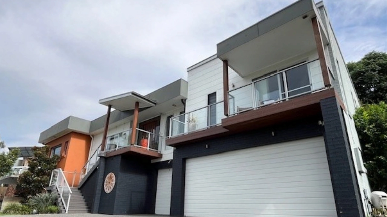
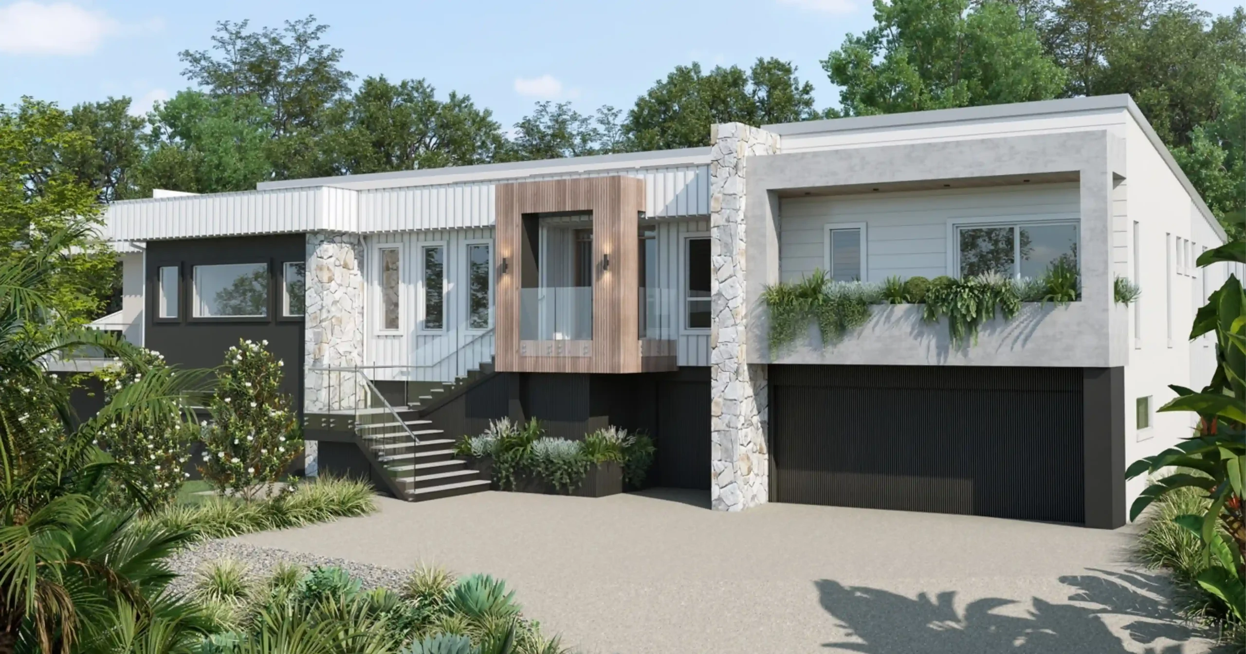
You could say it’s the same house, just wearing slightly different clothing.
The difference is that every new element was chosen to create better balance, improve the proportions and give the home a stronger connection to the ground.
Why Standing Seam Was More Than a Style Choice
There’s no denying that standing seam looks good. Its clean profile suits contemporary homes beautifully and adds architectural detail without making a façade feel busy.
But “it looks cool” isn’t enough of a reason to specify a material.
For this home, the vertical lines of the standing seam cladding had an important job to do. They interrupt the home’s strong horizontal form and encourage your eye to move vertically rather than simply following the full length of the building.
This helps the house feel more balanced and less elongated.
Rather than applying one finish across the entire façade, we used standing seam selectively. This created defined vertical moments and gave the architecture a clearer visual rhythm.
Repeating Vertical Elements Across the Façade
The standing seam wasn’t expected to do all the heavy lifting.
We repeated vertical forms through the stone feature walls and other architectural elements. Together, these features break the long façade into more considered sections.
The stone columns provide strong visual anchors, while the variation in height, depth and material gives your eye natural places to stop.
Without these vertical elements, the home could easily have felt like one long horizontal line sitting above the driveway. Instead, the façade now feels layered, balanced and grounded.
Yes, vertical design features are popular. But here, they weren’t added simply because they’re on-trend. They solved a very specific proportion problem.
That distinction matters.
Creating a Clearer Sense of Arrival
The original entry didn’t have enough presence within such a long façade.
A new front entry now creates a stronger focal point and gives you a much clearer sense of where to arrive. The widened stairs at the bottom also make the approach feel more generous and welcoming.
On the right-hand side, we introduced a new feature frame and integrated planter box.
This was an important part of the design because it’s one of the first elements you see as you come up the driveway. Rather than arriving at the end of a long, uninterrupted building, you’re greeted by a defined architectural feature softened with planting.
It creates interest where it matters—not just in a straight-on elevation drawing, but in the way you actually experience the home.
Using Darker Colours to Anchor the Home
The vertical elements help correct the proportions, while the darker colours along the lower section visually anchor the house.
Because the home sits high above the driveway, it needed greater visual weight at ground level. The deeper finishes create a stronger base and help the house feel connected to its site rather than perched above it.
The colour palette is important, of course. But colour is only one part of the design.
Without the changes to proportion, form, material and visual hierarchy, a new colour scheme alone wouldn’t have achieved the same result.
Adding Warmth Through Stone and Landscaping
With a cool contemporary palette and crisp standing seam cladding, the façade also needed warmth.
The feature stone introduces natural variation, texture and depth. It softens the cleaner architectural materials and makes the home feel more inviting without taking away from its contemporary character.
Landscaping adds another layer of softness.
The integrated planting, greenery around the entry and considered garden design help settle the architecture into its surroundings. The result feels less stark and more connected to the landscape.
These elements don’t compete with the home. They allow the stronger architectural features to feel balanced.
Keeping What Still Worked
A successful façade renovation doesn’t mean replacing everything.
We retained a significant amount of the home’s existing cladding and repainted it as part of the new palette. There was no reason to remove a material that was still performing well simply for the sake of making everything new.
Instead, we focused the investment on the changes that would have the greatest impact:
- New standing seam cladding in carefully selected areas
- Vertical stone feature walls
- A more defined front entry
- A new architectural frame and planter box
- Wider stairs at the base of the entry
- Darker finishes to visually anchor the home
- Landscaping to soften and connect the design
Every material was also selected with longevity and maintenance in mind. The finishes are low or no maintenance, making the design practical to live with—not just impressive when it’s first completed.
Good Façade Design Changes How You See the House
This transformation wasn’t about disguising the original home or making it look like something entirely different.
It was about understanding what wasn’t working and making considered changes to correct it.
The standing seam, stone walls and repeated vertical elements reduce the visual emphasis on the home’s length. The darker base grounds it. The new entry creates a clear focal point. The stone adds warmth, while the landscaping softens the architecture.
Individually, each change has a purpose. Together, they completely alter the way the home feels.
The result is contemporary without relying on short-lived ideas. The standing seam may be a long-lasting trend, but here, it earns its place because it works with the architecture and improves the home’s proportions.
And that’s always more important than following a trend simply because it looks good.
If your home feels too long, unbalanced or disconnected from its site, changing the colour may only be the beginning. A considered façade design looks at the complete picture—from proportion and architectural features to materials, texture, colour and landscaping—so every decision works together.
If you’re ready to explore what’s possible for your home, you’re welcome to book a complimentary consultation with me via the link below (or send me an email directly).
📧 jane@hotspaceconsultants.com
🌐 https://hotspaceconsultants.com/preliminary-enquiry/
Jane Eyles-Bennett