
Not every element of my client’s renovations is up for discussion. Sometimes a homeowner has windows (or a roof, wall cladding etc) in perfectly good condition that simply aren’t in the budget or the plan to replace, and the whole facade design needs to work around that fact rather than against it. That was the situation on this project. The existing brown windows were staying exactly where they were, so my job was to design a facade that made them look like a deliberate choice rather than something left over from before.
It’s one of the more interesting briefs I get, because the constraint actually sharpens the design thinking rather than limiting it.
👇👇 Designed by Hotspace 👇👇
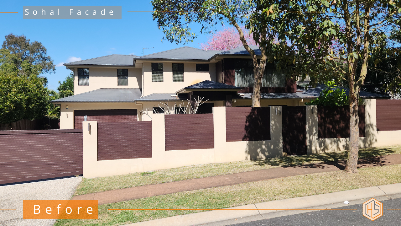
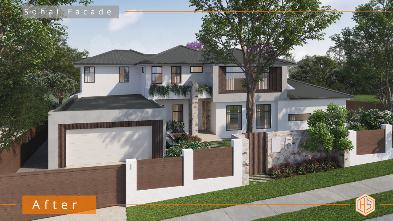
The Starting Point
This home originally had a pale, slightly dated cream render, a mid grey roof, and a front fence and matching garage door finished in a dark-ish timber paneling. The brown window frames sat throughout the home, original and staying put. On their own, none of these elements were a problem. Together, the palette felt flat and a decade or more out of date.
My clients also had a garage addition already designed by their building designer, planned for the left-hand side of the home. So alongside the facade refresh, I needed to make sure that new structure felt like part of the same house, not something bolted on afterwards.
The Design Challenges
The brown windows were the real fixed point of this project. Windows sit all over a facade, which means whatever palette I chose needed to sit comfortably next to that colour in multiple places, not just once near the front door.
The garage addition added another layer. It had already been drawn up structurally, so my role was to bring it into the same design language as the existing home, particularly around the large feature window on the top right, which lights the master bedroom and needed to read as part of one cohesive composition rather than a separate wing.
I also wanted to darken the roof. A darker roofline gives the eye something to anchor to, and it works particularly well alongside timber and stone tones.
The Design Decisions
I moved the walls from that creamy tone to a fresher, lighter colour, which immediately brought the home into the present day. That single shift does more heavy lifting than almost any other decision on a facade.
To bring the brown windows into the story rather than fighting them, I added considerably more timber across the facade, particularly around the upper bedroom window and garage door. The previous fence read as leftover and disconnected. Bringing in timber at a similar tone to the windows meant the whole facade started to feel intentional, like the colour was a choice rather than a compromise.
I introduced a stone feature to act as the glue between the timber tones and the new lighter render. Stone does that job well. It’s warm enough to sit alongside timber, but structured enough to read as considered rather than decorative.
For the new garage and the area around the feature window, I used a concrete-look render, which gave that section its own texture without pulling away from the rest of the home. It let the garage and the master bedroom’s feature window feel connected to the existing house and the front fence, rather than competing with them.
Landscaping came in at the end to soften all of this. Once you introduce more hard materials like timber and stone, the garden needs to do some balancing work, so I added planting around the entry and fence line to take the edge off the new elements and let everything settle together.
The Outcome
The finished facade doesn’t look like a home working around a limitation. It looks like the brown windows were part of the plan from day one, because by the time I’d finished, they were. The darker roof, fresher render, added timber and stone feature all work together, and the new garage addition reads as though it was always part of the original house rather than an afterthought.
That’s really the test of a good facade design when you’re working with existing elements. Nothing should look retrofitted. It should look like every decision, old and new, belongs to the same idea.
Practical Takeaways
If you’ve got an existing feature you can’t or don’t want to change, here’s what I’d suggest:
- Identify your true fixed point early, whether that’s windows, a roof, or a fence, and design everything else in relation to it
- Look for a material in a similar tone to bring that fixed element into your new palette rather than isolating it
- Use one connecting material, like stone or a feature render, to link old and new sections of the same home
- Don’t skip landscaping. Softer planting balances harder new materials like timber and stone
- If you’re adding a new structure, like a garage, make sure it’s designed to match the existing home’s character, not just sit next to it
Working through a full facade design plan before construction begins is what makes all of this possible without guesswork on site. If you’d like to see how that process works in more detail, there are some frequently asked questions about facade design plans on the site.
If you’ve got existing windows, a roof, or any other feature you’re keeping as part of your renovation, I’d love to help you design around it properly rather than in spite of it. I offer a complimentary consultation for homeowners who want clarity before committing to materials or builders. Get in touch and let’s talk through your place.
Jane
📧 jane@hotspaceconsultants.com
🌐 https://hotspaceconsultants.com/preliminary-enquiry/