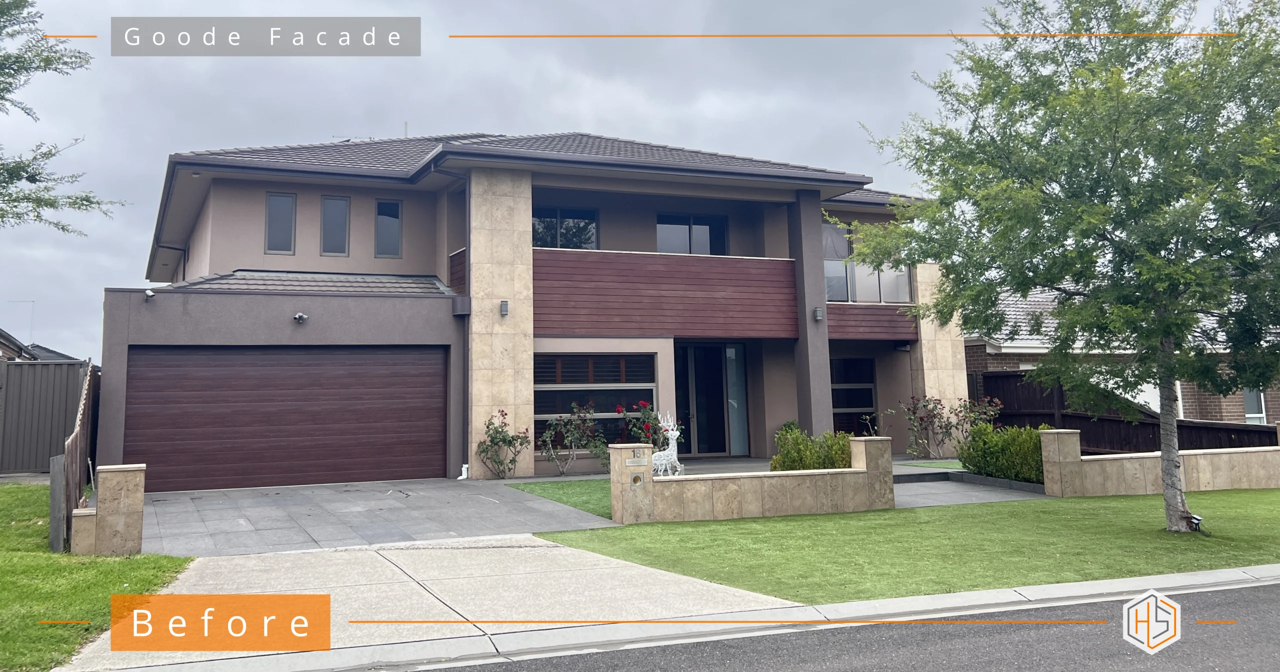
If you built a project home 10–20 years ago, it probably served you beautifully. It was practical. Sensible. Within budget. It allowed you to live in the area you love.
But now? You’ve grown. Your success has grown. Your equity has grown.
And your home… hasn’t.
The good news is that you don’t need to knock it down to create something remarkable.
You just need to redesign it properly.
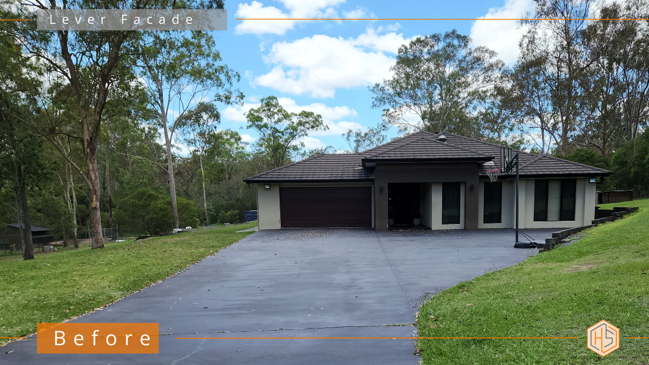
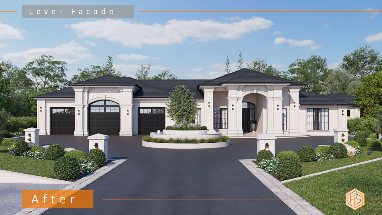
👇👇 Designed by Hotspace 👇👇
Step 1: Fix the Proportions (Before You Touch Colour)
Prestige isn’t about stone. It’s not about render. And it’s definitely not about picking a “luxury” colour palette.
Prestige comes from proportion.
Most project homes feel underwhelming because:
-
The garage dominates the facade
-
The entry lacks hierarchy
-
The roofline feels heavy
-
The house looks wide but not grounded
-
Windows aren’t aligned with intention
No amount of beautiful finishes will fix structural imbalance. When the proportions feel resolved, everything else falls into place.
This is why I always design structure first, materials second.
Step 2: Create Entry Hierarchy
If someone can’t immediately tell where your front door is, your facade lacks hierarchy. A well-designed entry creates presence. It creates arrival. And it makes the house feel intentional.
Prestige homes always have:
A shallow porch with two posts isn’t hierarchy.
It’s compliance.
Step 3: Add Depth and Shadow
Flat facades feel budget. On the other hand, prestige homes have:
-
Layering
-
Recesses
-
Projections
-
Defined framing
-
Shadow lines
Shadow is what makes architecture feel expensive. Sounds weird but it’s true.
When light hits depth correctly, it creates richness. Without depth, everything feels two-dimensional.
This is where many renovations fail – they add materials without adding architectural layering.
Prestige is not about adding more.
It’s about adding intention.
Step 4: Use Materials With Restraint
Luxury is rarely loud.
The most elevated homes use a limited, cohesive palette. Throwing stone cladding, timber battens, render, cladding and feature panels all on one facade doesn’t create prestige. It creates confusion.
Refinement is restraint – and that’s what we do to create a high end look.
Step 5: Anchor It With Landscaping
You cannot create a prestige property without addressing the front yard.
True high-end homes integrate structured planting, defined driveway edges, symmetry or easthetic balance and feature lighting
Architecture and landscape should feel like one composition – not two separate projects.
The Real Shift
Turning a project home into a prestige property isn’t about pretending it’s something it’s not.
It’s about elevating what’s already there.
Your home once reflected what you could afford. Now it can reflect who you are.
And when you pull into your driveway and feel that quiet sense of pride – not because it’s flashy, but because it feels resolved, that’s when you know it’s been designed properly.
If you’re considering a facade renovation and don’t want to waste money on cosmetic upgrades that miss the bigger picture, start with a design plan from Hotspace.
Send me some photos via email or the link below and I’ll be in touch… 📧 jane@hotspaceconsultants.com
Jane https://hotspaceconsultants.com/preliminary-enquiry/
A coastal home renovation should make your house feel intentionally calm and cohesive, usually with the use of naturally warm colours and textures.
Too many coastal-style renovations end up looking busy – all-blue (see below!), layered cladding, mixed materials, strong contrasts and added features that compete rather than complement.
If you’re planning a coastal home renovation, here’s what actually makes it work.
👇👇 Designed by Hotspace 👇👇
1. Start With Proportion Before You Choose Finishes
Most homeowners jump straight to colours and materials. But if the lines of your home feel awkward or heavy, no amount of beautiful cladding will fix that.
Before selecting products, ask:
-
Are vertical and horizontal lines balanced?
-
Does one level visually dominate another?
-
Do balcony edges align cleanly?
-
Is there unnecessary visual clutter?
A successful coastal home renovation feels calm because the structure feels resolved first.
2. Keep the Colour Palette Warm – Not Stark
Coastal doesn’t mean bright white and high contrast. In fact, overly crisp whites and dark trims can make a facade feel harsh and busy.
Instead, aim for:
-
Soft, warm whites
-
Muted sandy tones
-
Natural timber finishes
-
Subtle stone textures
Warmth creates sophistication. Stark contrast creates noise.
When renovating a coastal home, think sun-faded and grounded – not sharp and shiny.
3. Limit Your Materials
One of the biggest mistakes in a coastal home renovation is using too many feature materials. Coastal style is built on simplicity.
A good rule of thumb:
-
One dominant material
-
One secondary texture
-
One accent
That’s it.
Layering beyond that often reduces cohesion rather than increasing interest.
4. Integrate Shade and Screening Into the Design
Coastal homes need sun protection – but it should look intentional.
If blinds, shutters or screens feel like they were added later, the whole facade can lose refinement.
When planning your coastal home renovation, ensure:
-
Screening aligns with architectural lines
-
Colours match or complement the main palette
-
Shade elements look built-in, not attached
Good coastal design hides practicality inside elegance.
5. Think About How It Feels – Not Just How It Looks
A calm coastal home should feel:
-
Balanced
-
Light
-
Grounded
-
Uncomplicated
If your renovation plan feels layered, fussy or overly detailed, it may be drifting away from coastal refinement.
Often, the most successful coastal home renovations come from editing, removing unnecessary elements rather than adding more.
Refinement is the real upgrade!
A coastal home renovation isn’t about recreating a beach shack or copying a Pinterest board. It’s about creating a cohesive exterior that feels warm, settled and intentionally designed.
When proportion is resolved, materials are restrained and colours are naturally warm, the result isn’t just coastal, it’s refined.
If you’re planning an exterior renovation and want a clear, expert approach – not guesswork – send me some photos via email or the link below…. 📧 jane@hotspaceconsultants.com
Jane https://hotspaceconsultants.com/preliminary-enquiry/
When people contact me about a renovation, they often lead with the same question: “What house colours should we choose?”
And this is where I see the biggest mistake being made. Many homeowners believe that picking new colours is enough to transform their home. That a fresh palette alone will do the heavy lifting.
In reality, colour on its own rarely delivers a true transformation – especially during a renovation.
👇👇 Designed by Hotspace 👇👇
House colours aren’t the starting point
In my work, colours are almost never the first decision I make.
They’re usually the fourth or fifth.
Before I even think about colour, I’m looking at things like:
-
the overall proportions of the home
-
rooflines and how the house is visually grounded
-
the entry and whether it feels clear and intentional
-
the balance between old and new elements
Only once those decisions are resolved does colour come into play, because by then, it has a job to do.
Why choosing house colours first often disappoints
When your colours are chosen too early, they’re expected to fix problems they simply can’t.
Colour can’t correct poor hierarchy.
It can’t resolve awkward proportions.
And it can’t make a renovation feel cohesive if the design underneath isn’t there.
This is why I so often see homes that have been freshly painted – yet still feel unfinished or underwhelming.
Where colour actually makes the difference
When house colours are selected at the right stage of a renovation, they become incredibly powerful.
They can reinforce proportions that already work. They visually connect new additions to the existing home. And they create depth, calm and balance across the facade.
The takeaway
House colours are essential – but they’re not the magic wand many people hope they are.
If you’re renovating and want a result that genuinely feels transformed, colour needs to support the design, not lead it.
In the right order, and in the right hands, house colours don’t just change a home – they complete it.
If you’re planning an exterior renovation and want a clear, considered approach – not guesswork – get in touch via email or the link below…. 📧 jane@hotspaceconsultants.com
Jane https://hotspaceconsultants.com/contact-us/
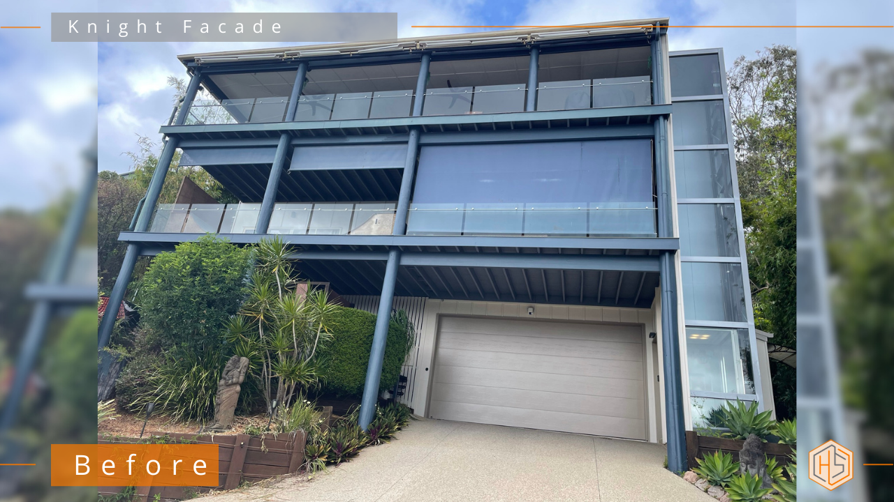
If you’re considering a carport extension, you might think you’re solving just one problem. More cover, more storage, and somewhere better to park the car.
But in my experience, adding a carport, garage or extension is often the moment everything else finally clicks. It becomes the catalyst to re-thinking your entire exterior.
👇👇 Designed by Hotspace 👇👇
Why a Carport Extension Changes Everything
A carport or garage isn’t a small add-on. It’s a large, highly visible element that instantly affects the balance, proportions and style of your home. Once it’s added, the rest of the facade either works with it or fights against it.
This is where many renovations fall apart.
Out and about, I regularly see carport designs that are well intentioned but completely out of sync with the home they’re attached to. The carport is new, yet the facade around it hasn’t been updated. Or the style of the carport is a mismatch that makes the house feel unfinished.
Treat your carport extension as the starting point for the overall exterior, and the transformation becomes far more cohesive.
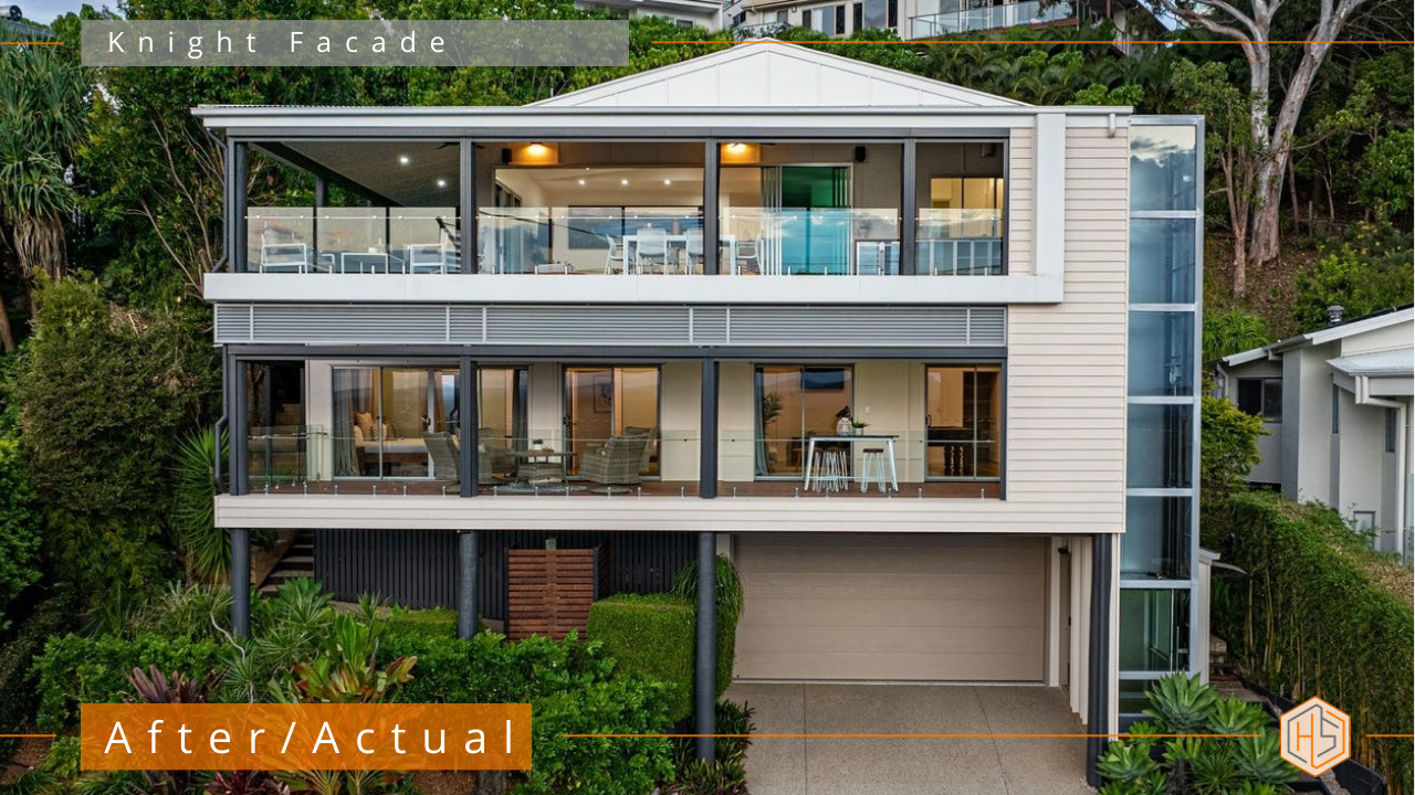
How to make your Carport or Garage the Design Anchor (and why it’s important)
When I design house facades (with a new carport/garage etc), I’ll often use the carport or garage as the visual anchor for the whole home. It allows you to reset the exterior language and then flow that logic across the facade.
This might include:
-
Updating materials so the carport feels intentional, not tacked on
-
Aligning rooflines and fascia details
-
Introducing new textures that repeat across the home
-
Reworking the front entry so it feels connected and welcoming
-
Using the extension to improve scale and street presence
Suddenly, the house reads as one cohesive design rather than a series of past decisions.
Carport Extension Ideas That Go Beyond Parking
A well-designed carport or garage extension can do far more than just shelter a car. It can create a stronger sense of arrival at the front of the home, add architectural weight and presence, and improve privacy from the street.
When thoughtfully designed, it can also allow for concealed storage or services, set the tone for a more modern or elevated aesthetic, and increase the perceived value of the home before you even step inside.
That’s why I always encourage clients to think bigger than just the structure itself.
What to Consider Before You Build
Before locking anything in, ask yourself:
-
Does this carport or garage match the style the house wants to be?
-
Will the materials work with the rest of the facade?
-
Should this be the moment the exterior gets fully refreshed?
-
How will this extension change the way the home is seen from the street?
These questions are going to save you time, money and regret, down the track!
Why This Approach Works So Well
When a carport extension is designed as part of a broader exterior strategy, the result is a home that looks genuinely updated rather than partially renovated. The facade has better visual balance and stronger street appeal, the renovation feels considered rather than reactive, and decisions around materials and colour feel far more confident. Most importantly, the end result actually feels worth the investment. This is where good exterior design earns its keep!
If you’re going to do it, do it properly and let your carport be the beginning, not the end!
Thinking of an exterior upgrade? Email me photos of your house and I’ll see if I can help… 📧 jane@hotspaceconsultants.com
Jane https://hotspaceconsultants.com/contact-us/
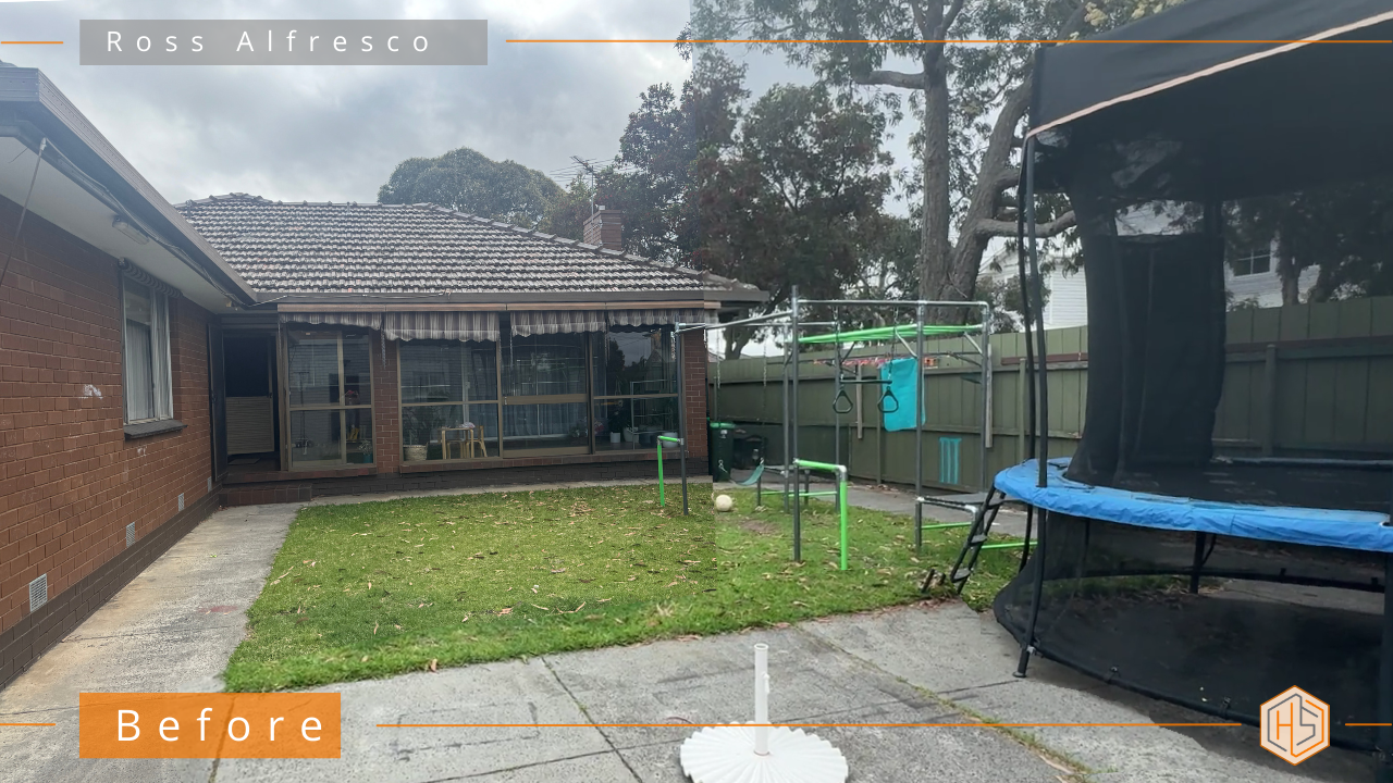
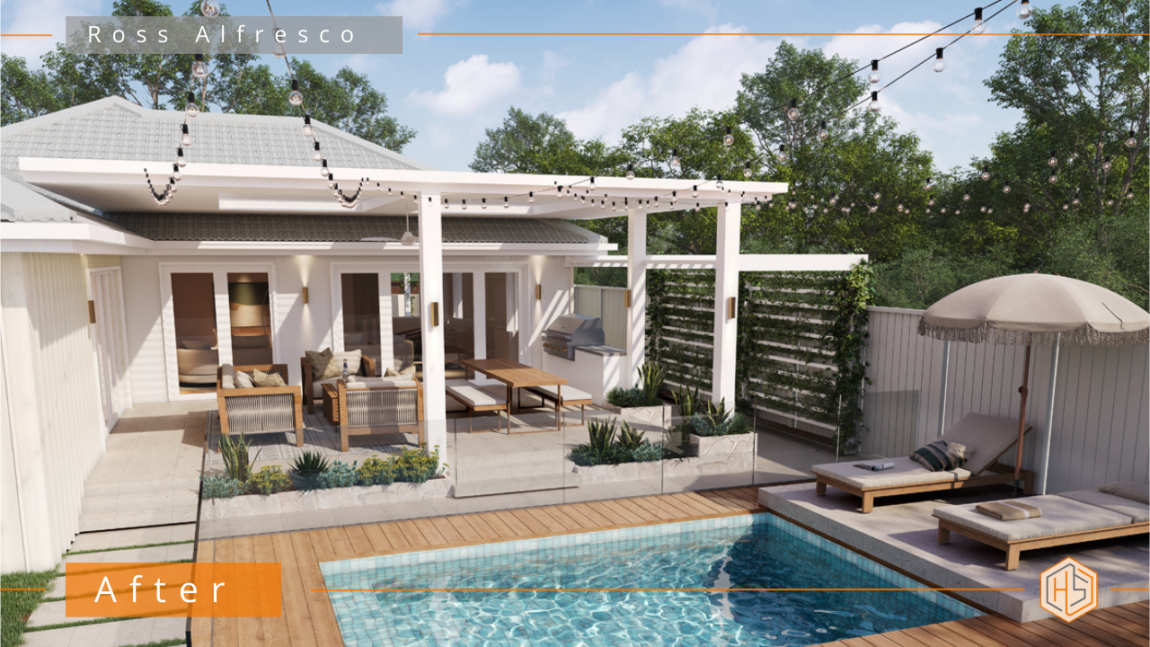
You don’t overhaul your outdoor living areas every day, so when you do, the vibe has to be right. Too often, outdoor spaces are reduced to a roof and a slab, without any real thought given to atmosphere, flow or how the space will be lived in.
That’s the difference between an alfresco that’s just there… and one that genuinely becomes part of the home.
Here’s what to think about before you begin – to make sure the end result feels effortless, beautiful and genuinely liveable.
👇👇 Designed by Hotspace 👇👇
Outdoor living ideas worth considering before you begin
> Zones that work together
Successful outdoor living starts with clear zones for lounging, dining, cooking and play; connected naturally, without competing for attention. Think about how each zone relates to the next, how people move between them, and whether the layout feels calm rather than crowded.
>> Room for everyday life and extra people
Plan beyond daily use and allow for extra seating and flexibility when friends drop by. Think about where they can comfortably sit or perch, without disrupting how the space works day to day. For example, wider steps that function as both circulation and occasional seating.
>> Materials that are beautiful, but forgiving
Low-maintenance living relies on materials that deliver a relaxed, natural look without constant upkeep. Think about finishes that age well, hide wear, and suit your lifestyle – not just how they look on day one.
>> Furniture that truly fits the space
Good outdoor living design considers furniture scale, circulation and comfort – especially if re-using existing pieces. Think about how much room people need to move, sit and relax, and whether the furniture suits the proportions of the space.
>> Day-to-night usability
Thoughtful outdoor living includes lighting that works during the day and creates atmosphere at night, without overwhelming the space. Think about layered lighting that supports everyday use, entertaining and ambience – not just brightness. I love to use dimmers wherever possible!
>> Privacy without heaviness
Effective outdoor spaces balance enclosure and openness, creating privacy that feels calm rather than closed-in. Think about where privacy is needed most and how it can be achieved through layout, screening or planting, rather than solid walls.
>> Indoor-outdoor flow
Indoor-outdoor flow connects the inside to the outside with (e.g) aligned floor levels, materials and sightlines that make the alfresco feel like a natural extension, not an add-on. Pay attention to how the space will feel when you step outside, and whether the transition feels natural, cohesive and considered.
When these elements are addressed early on, your outdoor living area stops feeling like a feature tacked onto the house. It becomes the place everyone gravitates to – easy to live in, easy to share, and designed for the way real life unfolds.
Thinking your home (and outdoor living spaces) have more potential? Email me photos of your house and I’ll see how I can help… 📧 jane@hotspaceconsultants.com
Jane https://hotspaceconsultants.com/contact-us/
When I assess a home’s street appeal, I almost always start by looking up. Not at the paint colour, not the windows, not the landscaping – but the roofline and roof colours. Together, they quietly dictate the style, proportions and presence of the entire house.
Low, flat, under-considered rooflines, combined with poorly chosen colours are one of the biggest reasons a home feels bland, dated or forgettable. They can visually squash a house, erase any sense of arrival and leave the facade feeling limp, no matter how nice the finishes underneath might be.
Before you panic and start thinking your home has no hope, let me reassure you; small, strategic changes to the roof or a new entrance structure can bring even the most ordinary house to life. And often, adjusting roof colours alone can make a surprisingly big impact.
Your roofline is the crown of your home. Get it right, and everything underneath suddenly makes sense.
👇👇Designed by Hotspace 👇👇
Flat and Low Rooflines: Why Roof Colours Matter Even More
Very low or flat rooflines can work – but only in specific architectural styles and with deliberate, confident detailing. In these cases, roof colours become even more important, because the roofline itself isn’t doing much of the visual work.
In most existing homes, flat rooflines paired with the wrong colouring results in:
- A house that feels visually squashed
- No clear focal point or entry
- A facade that looks wide and heavy rather than elegant
- Little sense of architectural intention
This is why roof colours should never be an afterthought. They’re a design decision, not just a practical one.
The Power of an Entrance Structure (and How Roof Colours Tie In)
If there’s one design move that can transform a home without touching the entire roof, it’s a new entrance structure.
A well-designed entry:
- Adds height and presence
- Creates a clear sense of arrival
- Introduces character and architectural style
- Allows roof colours to be rebalanced and better integrated
Often, the entry is where I’ll introduce contrasting materials to add depth and interest without overwhelming the home.
Roof Styles Explained (and How Colour Influences Them)
Parapet Roofs
A parapet is a wall that extends above the roofline, hiding the roof behind it when viewed from the street.
Parapet roofs suit:
- Coastal and Palm Springs-inspired styles
- Contemporary and modern homes
Even though the roof is mostly hidden, the colour still matters; especially for side views and upper levels. But the focus shifts to clean lines and wall finishes.
Gable Roofs
A gable is the classic triangular roof form, where two sloping sides meet at a central ridge.
Gables work beautifully for:
- Hamptons
- Cape Cod
- Farmhouse
- Cottage and traditional homes
With gable roofs, roof colour is usually highly visible and plays a huge role in defining the home’s personality. Lighter roofs feel relaxed and coastal, while darker roofs add contrast and substance.
Hip Roofs
A hip roof slopes down on all four sides and is one of the most common roof styles in Australia.
Hip roofs are practical, but without the right colour they can feel heavy or dated. Choosing the right roof colour – and sometimes combining it with an upgraded entry – can completely modernise the look.
Materials and Colours: Tiles vs Colorbond
Roof material and colour go hand in hand.
Roof tiles suit:
- Mediterranean
- Spanish
- Tuscan and traditional styles
Tiles tend to have more visual weight, so darker roof colours can make a house feel solid and grounded, while lighter roof colours can soften the overall look.
Colorbond roofing offers a wide range of roof colours and suits:
- Coastal and Hamptons homes
- Farmhouse styles
- Contemporary designs
Because Colorbond has clean lines, roof colours read very clearly from the street, making colour selection even more important.
Choosing Colours: Light vs Dark
Roof colours dramatically affect how your home feels.
- Lighter colours create a coastal, airy, relaxed look and can make a home feel larger and fresher
- Darker colours give a home depth, presence and a more substantial, grounded appearance
Darker colours are also more forgiving when it comes to dirt, weathering and ageing, making them a practical choice as well as a stylish one.
How Roof Colours Can Change Proportions
This is one of my most-used exterior design tricks.
Want Your House to Look Taller?
Paint your fascias – and sometimes gutters – the same colour as the walls. This reduces contrast at the roofline and visually elongates the facade, regardless of roof colour.
Want to Ground a Tall or Dominant Roof?
Paint your gutters – and sometimes fascias – the same colour as the roof. This visually lowers the roof and helps darker or more dominant roof colours feel balanced.
The Big Takeaway on Roof Colours and Rooflines
If your home feels flat, dated or underwhelming, don’t start with paint alone. Start by looking up – at both your roofline and your roof colours.
They set the tone for your entire home and influence how every other element is perceived. And in most cases, you don’t need a full rebuild – just informed design decisions that consider structure, material and roof colour together.
That’s where real transformation happens.
Thinking your home (and roofline) has more potential? Email me photos of your house and I’ll see how I can help… jane@hotspaceconsultants.com
Jane https://hotspaceconsultants.com/preliminary-enquiry/