
A lot of conversations with homeowners start with a material. Someone has fallen for a particular stone, a cladding profile or a beautiful timber door, and they want to know where it should go. It’s a good instinct, and materials matter. But on this canal-front home on the Sunshine Coast, the real issue wasn’t a lack of nice finishes. It was a flat facade, and no single product was ever going to fix that on its own.
This project is a good example of why I think about depth first and materials second.
✨ Designed by The Facade Design Co ✨
Three Gables and Still No Depth
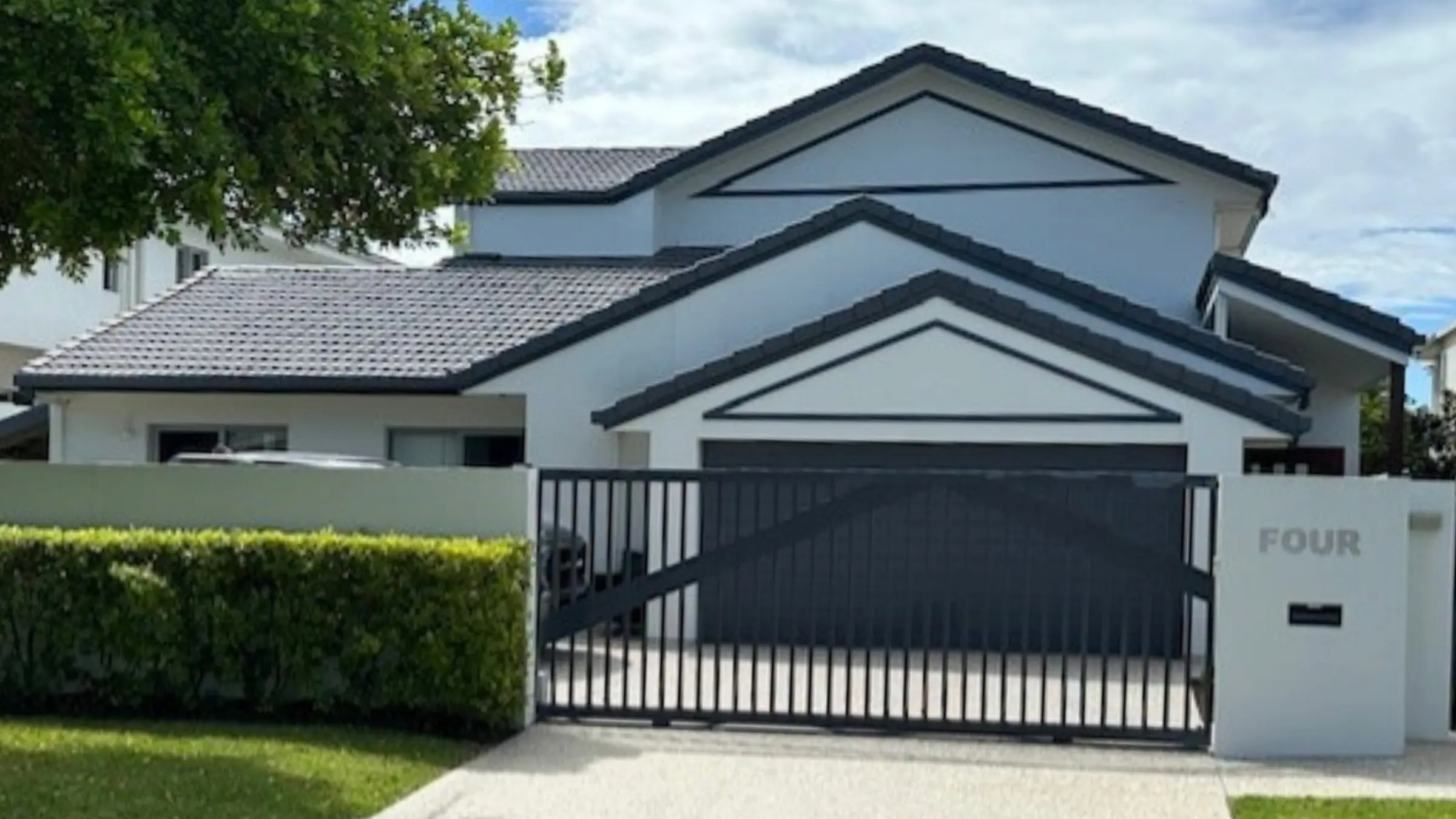
On paper, this house had a lot going for it. It’s a solid two-storey home with a tiled roof in good condition, and three gables step down towards the street. A roofline like that should give a front plenty of character.
But from the street, it didn’t.
Every surface was rendered the same bright white, including the walls, all three gables and the areas between them. The gables had thin dark trim lines run inside them, which were clearly meant to add interest. In practice, they read more like outlines drawn onto a flat surface than real architectural detail.
The charcoal garage door was the biggest dark shape on the whole front, so that’s where your eye went first. The front door, the part of the house that should welcome you, was tucked off to the side with almost no presence.
Canal homes often put most of their energy into the water side, and that makes sense, because that’s where the living happens. The street side can be left saying very little.
The owners were keen to keep the existing roof tiles and work within the current footprint. So any change had to come from the walls, the gables, the entry and the front boundary.
Why a Flat Facade Can’t Be Fixed With Finishes Alone
This is where I see people go wrong, and it’s completely understandable.
When a house looks plain, the natural response is to add something better: stone, cladding or a premium render. But if you wrap an entire front in the same beautiful material, you still end up with one surface. It might look more expensive. It will still look flat.
Depth on a facade comes from a handful of things working together:
- planes that step forward and back
- a clear hierarchy of light and dark tones
- shadow lines that change through the day
- materials placed where they have a reason to be
On this home, I couldn’t change the roofline or push walls forward, apart from at the entry. So the question became how to make three gables that already step down actually read as three separate layers. Each one needed its own job, and getting the scale and proportion of those layers right mattered more than any individual finish.
The entry was the one place I could create genuine forward projection. That made it the most valuable opportunity on the whole front.
Deciding What Comes Forward and What Steps Back
Before choosing a single product, I worked out which parts of the house should come forward visually, which should recede, and where the eye should land. The materials followed from that.
The gables
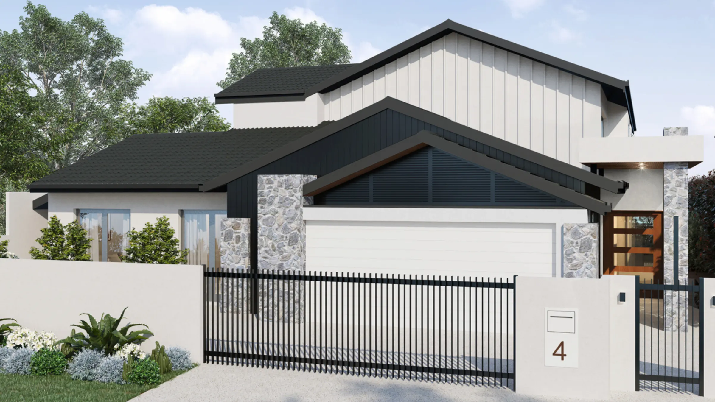
I treated the three gables as a tonal sequence rather than three matching triangles.
The upper gable is clad in light vertical board-and-batten. It keeps that highest part of the house light, so it sits quietly at the back of the composition. The vertical battens also add fine shadow lines, giving the surface texture without making it busy.
The middle gable goes dark in vertical cladding. It reads as a band sitting behind the lowest gable, which immediately separates the two.
The lowest gable is the darkest and most recessed. Dark battened infill sits back within the frame, and a timber lining under the eave catches the light. Dark recesses read as deeper than they really are, so this gable now feels like it has real volume.
The old trim outlines are gone. They aren’t needed once each gable has its own tone and texture. I’ve written before about using more than one tone of cladding, and this is a clear case of that approach doing the heavy lifting.
The entry
The new flat-roofed portico projects forward from the house and finally gives the front door the presence it was missing. Its horizontal form also contrasts with all the pitched gables, which keeps the front from feeling repetitive.
A stone column anchors one side. A downlight sits in the soffit, and a timber front door brings warmth at eye level, right where visitors will notice it.
The stone
I used natural stone as piers either side of the garage, on the portico column and on a section of the front fence. These are all places where you’d expect something solid to be carrying weight.
That’s deliberate. Stone looks right when it appears to be doing a structural job. Spread across a whole wall, it would have competed with everything else. In these few spots, it grounds the house and links the home to the boundary.
Colour and the garage door
The walls have changed colour only slightly. The garage door changed from charcoal to white. That might seem like a small decision, but it’s one of the most important on the front. Dark colours pull the eye. On the original house, all that attention went to the garage. Now the door blends into the wall, and the dark tones have moved up into the gables, where they create depth instead of drawing focus to the least interesting part of the house.
The gate and front fence
The new driveway gate uses simple vertical slats without the diagonal brace, so it reads as calm and lets the house be seen through it. The rendered fence, stone section, pedestrian gate and clean letterbox with its house number tie the boundary back to the architecture.
All of this was resolved in a comprehensive facade design plan which I prepared for my client, before work began on site. That means the builder and trades can get on with doing what they do well, without anyone having to make design calls on the fly.
How It Reads From the Street Now
The front now has layers. Your eye moves from the stone piers to the dark lower gable, back through the middle gable, and up to the light board-and-batten at the top. The entry steps forward and tells you exactly where to go. The garage, which used to dominate, now sits back where it belongs.
None of this relies on anything dramatic. The roof tiles are the same. The footprint is the same. What’s changed is how each surface relates to the ones around it, and that’s what gives a design staying power. If you’d like to see more, here are some of the other homes I’ve redesigned using the same thinking.
What I’d Want You to Take From This
If your home feels flat, it’s worth stepping back before you start choosing finishes. A few things I’d suggest:
- Take a photo of your facade and turn it black and white. If everything is one shade of grey, tone is your first problem, not materials.
- Decide what should come forward and what should recede before you pick a single product.
- Put your darkest colours where you want depth, not on your largest flat surface.
- Use feature materials like stone where they’d logically carry weight.
- Don’t assume you need to change the roof or footprint. Often the existing bones are better than they look.
Good materials make a well-planned facade look even better. They just can’t do the planning for you.
If you’re about to renovate or build and something about your front isn’t sitting right, Iget in touch to see if I can help. You can book a complimentary consultation, and we’ll look at where your home’s depth is hiding before any decisions are locked in.
Jane