
Every so often a project comes along that reminds me why I love this work. Not because the house needed saving, and not because the transformation was dramatic. This facade makeover is the opposite of dramatic, and that’s exactly the point.
When the owners of this two storey home first came to me, their house wasn’t a problem. It was new-ish, well-built, and perfectly liveable. But it looked like a hundred other homes on a hundred other streets. Nothing about the front of the house said anything about who lived inside it.
That’s a familiar starting point for me, and it’s one of my favourite kinds of project to work on.
👇👇 Designed by Hotspace 👇👇

The Starting Point
The before photo tells the story clearly enough. A rendered upper level in a flat, cool grey. A stacked stone feature wrapping the entry and garage corner, done in a warm sandstone tone that didn’t quite sit with anything else on the facade. A dark, heavy garage door taking up a huge portion of the street-facing elevation. A simple timber paling fence.
None of it was wrong, exactly. It just wasn’t working together. The colours were fighting each other rather than supporting one another, and the proportions of the stone feature made the entry feel bulky rather than considered.
The owners weren’t after a new house. They loved where they lived, they loved the floor plan, and they had no interest in structural changes, extensions or anything that meant moving out for months. What they wanted was for the outside of their home to finally feel as good as the inside and back yard already did.
That’s a request I hear often! A facade makeover doesn’t need to involve rebuilding anything. It needs someone to look properly at what’s already there and work out what’s holding it back.
The Design Challenges
Working with an existing facade brings a different kind of challenge to working from a blank page. I couldn’t move a window, change a roofline or shift a garage door. Every decision had to work within the footprint that already existed.
The first thing I needed to solve was the stone feature. It was well-built and structurally there to stay, so ripping it out was never on the table, nor was it necessary. My job was to work out how to bring it into balance with everything around it rather than have it dominate the corner of the house.
The second challenge was the upper level. A single flat render finish across such a large surface area gave the whole facade a heaviness that didn’t suit the home’s actual scale. I needed a way to break that surface up and add depth and texture, without adding a single extra square metre of construction.
The garage door was the third piece of the puzzle. On a lot of homes, the garage ends up dominating the street view simply because it’s the largest single element at eye level. I needed a solution that let the garage recede into the background rather than announce itself.
None of these were expensive problems to fix. They were thinking problems. And that’s where a facade design plan earns its place before construction starts, because working through these decisions on paper, tested and detailed properly, is a lot cheaper than working them out on scaffolding.
The Design Decisions
Once I understood what needed solving, the decisions themselves were about restraint rather than addition.
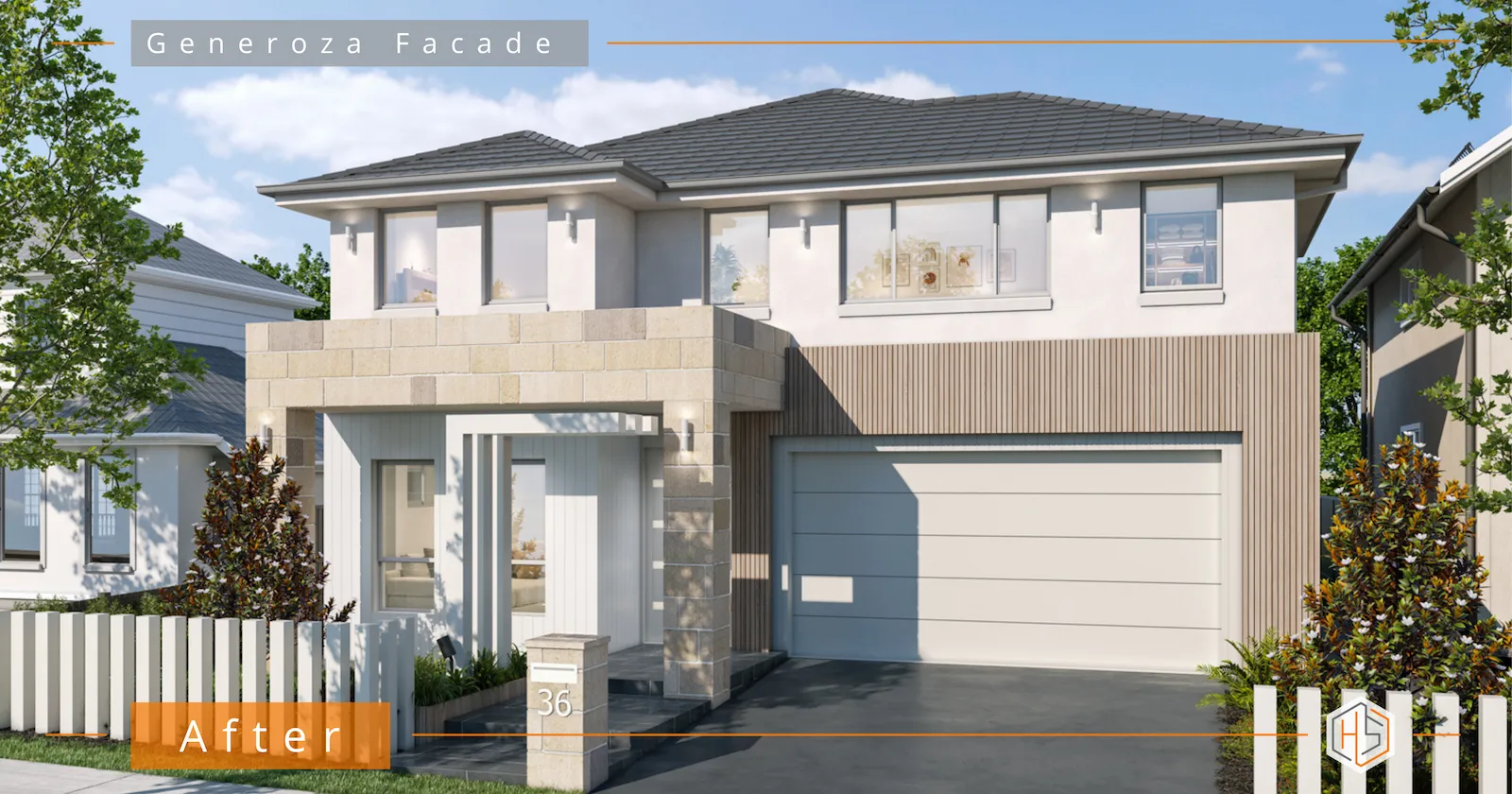
For the upper level, I introduced vertical timber battens in a warm, natural tone. This did two things at once. It broke up that heavy flat render into a more human, textured surface, and it gave the home a contemporary edge without pushing it into a style that would date quickly. Timber battens are forgiving that way. They read as considered rather than trendy.
For the stone, I kept the material, because it was already there and it was a quality product. What I changed was its relationship to everything around it. Softening the surrounding palette to a lighter, warmer white let the stone read as a genuine feature rather than competing for attention against a busy backdrop.
The garage door was repainted in a lighter tone closer to the main render colour, which immediately reduced how much visual weight it carried on the elevation. Paired with the newly painted white fence, the whole lower half of the facade now feels lighter and more welcoming rather than closed off.
A few of the decisions that mattered most in this project:
- Choosing warm timber tones to soften a large expanse of render
- Retaining the existing stone rather than replacing a perfectly good material
- Lightening the garage door colour instead of replacing the door itself
- Selecting a fence style that complements the new palette rather than competing with it
- Making sure every material specified was available locally, suited to our climate, and within a realistic budget
Nothing about this list would surprise anyone once they’ve seen the after photo. That’s exactly why the plan behind it matters. Getting to “obvious in hindsight” takes a lot of testing options that don’t work before you land on the ones that do.
The Outcome
The finished facade doesn’t shout – and it doesn’t need to. What it does is feel considered, calm and complete, in a way the original never quite managed.
Nothing about the layout changed. No walls moved. No windows shifted. What changed was the relationship between colour, material and proportion, and that’s often where the real value in a facade design plan sits. It’s not about how much gets done. It’s about how well it’s thought through before anyone picks up a paintbrush or a batten.
This is also why I always give clients more than a pretty picture. Behind this result sits a full specification, down to the exact products, finishes and quantities needed, so the builder or painter working from it isn’t guessing either. A design that can’t be built accurately isn’t much use to anyone, no matter how good it looks as a render.
Practical Takeaways
If there’s one thing this project shows, it’s that a facade doesn’t need a big budget or a big disruption to feel genuinely different. A few things I’d encourage any homeowner to keep in mind before starting their own renovation:
- Work out what’s actually causing the problem before deciding what to change. Often it’s a relationship between elements, not the elements themselves.
- Keep what’s already good quality. Removing a well-built feature just because it isn’t working yet is rarely the answer.
- Get the specification right before construction starts. It’s far cheaper to test ideas on paper than to test them on your own house.
- Choose materials suited to your climate and available locally. The best-looking finish on Pinterest is no use if it can’t be sourced or maintained properly here.
A facade makeover done properly should look simple once it’s finished. That simplicity is the result of a lot of decisions made carefully, not a lack of thought.
If your home feels a bit like this one did – solid, liveable, but not quite saying anything about who lives there, it might not need nearly as much change as you’d expect. I’d love to talk it through with you. Book a complimentary consultation (link below) and let’s have a proper look at what your home’s already got going for it.
Jane
📧 jane@hotspaceconsultants.com
🌐 https://hotspaceconsultants.com/preliminary-enquiry/