
Over the past decade, white and grey became the go-to palette for Australian homes. Crisp white render, charcoal trims, a grey roof. It was clean and safe, and for a while it felt very current.
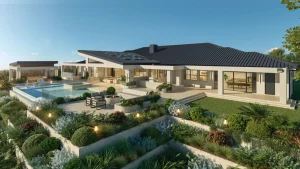
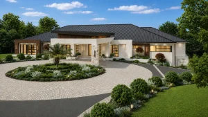
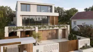
Lately, though, I’m hearing the same thing from homeowners again and again. Their house looks fine, but it feels a little cold. And when they show me the façades they’re drawn to now, almost every one is built on warm exterior colour schemes, with earthy neutrals, a touch of stone and some texture.
The good news is that you rarely need to start from scratch to get there. Here I’ll break down what makes those warmer façades work, and how I’d adapt that inspiration to an existing white and grey home in a realistic way.
✨ Designed by The Facade Design Co ✨
Why white and grey can start to feel flat
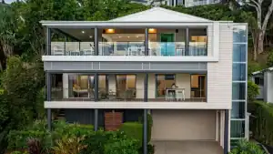
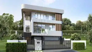
There’s nothing wrong with a white and grey house exterior. It’s a solid base. The trouble is that cool whites and greys can read as quite stark under our strong Australian light, especially on larger, simpler forms. Without texture or variation, the whole façade flattens out into one plane.
What people respond to in the homes they admire is usually a combination of elements working together. When I look at warmer façades I’ve designed, or ones a client has saved (on Pinterest etc), I find four ingredients doing most of the work.
Breaking down the inspiration
Warm exterior colour schemes that are still neutral
Colour is always where I start. The façades people love right now aren’t bold. They’re still neutral, but the undertones have shifted.
Instead of cool, blue-based greys and bright whites, you’ll see warm whites, soft creams, mushroom and stone tones, and deeper earthy shades for accents. They feel more inviting from the street because they respond better to natural light, picking up warmth in the morning and late afternoon rather than looking clinical at midday.
On an existing white and grey home, a shift in colour often makes the biggest difference with the least disruption. Repainting render, trims and even the front door can change the whole character of the house.
I always test colours against any fixed elements first: eg the roof, existing brick, pavers, window frames etc. Whatever is staying, the new palette has to work with them.
Feature stone, used with restraint
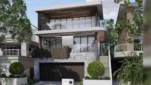
Look closely at the façades you’ve been saving and you’ll notice there’s usually only a small amount of stone. It might wrap a front pier, frame the entry or sit on a single wall.
That restraint is deliberate. A little stone adds weight and a grounded, natural feel. Too much and the house starts to look heavy, or the stone stops feeling special.
I also prefer stone that doesn’t create a strong contrast with the rest of the house. A stone in tones that relate to your new paint colours will sit comfortably. A high-contrast stone against white render tends to look added on rather than designed in.
Texture through cladding
The third element is texture, which usually comes through cladding in smaller quantities. This is what stops a rendered façade from reading as one flat surface.
There are a few ways to approach it:
- Vertical cladding adds height and works well to give the optical illusion of a home appearing taller
- Horizontal cladding can feel more relaxed and visually lengthen a home
- A colour close to your main house colour lets the texture do the work quietly
- A contrasting timber-look finish brings instant warmth and pairs well with an earthy palette
Where you place cladding matters as much as which profile you choose. I look for the parts of the house that deserve emphasis, and the large walls that benefit from a change of material.
Lighting at the right scale
Lighting is the last item on this list, and the one people most often underestimate.
The most common issue I see is fittings that are too small for the façade. A tiny wall light on a tall wall looks a bit dinky and lost. Lights should relate to the wall they sit on, the height of the door and the overall size of the house.
I also encourage clients to treat lighting as part of the daytime design as well as the night-time effect. Black or dark bronze fittings in a considered shape add a layer of character even when they’re switched off. They finish the house, a little like jewellery, rather than disappearing into it.
Bringing it together on your own home
The real skill lies in balancing these elements against what you already have. Some white and grey homes have great bones and simply need warmth. Others have competing materials that need simplifying before anything new is added.
Warm exterior colour schemes, stone, cladding and lighting all need to be considered together. I’ve seen homeowners choose a lovely stone, a beautiful cladding and a warm paint colour separately, only to find they don’t quite sit well together once they’re on the house.
When I prepare a Façade Design Plan for a client, every colour, material and fitting is chosen in relation to everything else, and to the parts of the home that won’t change. The decisions are made with confidence before anyone arrives on site, and your builder or painter has clear direction to work from.
What to keep in mind
If you’re starting to think about your own home, these are the observations I’d share:
- Start with colour, and test it against any fixed elements in natural light
- Use stone sparingly, in tones that relate to your palette
- Place cladding where it adds emphasis or breaks up large, flat walls
- Choose lighting that suits the scale of your façade and looks good by day
Most of all, see your white and grey house as a starting point rather than a problem. It’s a calm, neutral canvas. With some warmth, texture and layering, warm exterior colour schemes can make it feel far more personal and welcoming without losing its simplicity.
When you’d like a second pair of eyes
If you’re looking at your home and not sure which of these changes would make the most difference, I’d be glad to help. You’re welcome to book a complimentary consultation, or send me an email to the address below and we can talk through the possibilities for your façade before you commit to any paint, stone or cladding.