
I get asked some version of the same question almost every week. Someone sends me a photo of their house, usually looking a bit sheepish about it, and asks whether it’s actually possible to make it look like a different place. Not just tidied up. Different.
This project is the answer I wish I could hand to every one of those homeowners.
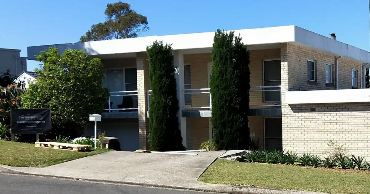
The house was built in 1962. Two storeys, a flat roofline, a balcony running the full width of the upper level. When the owners first showed it to me, I understood straight away why they felt a bit stuck with it. The brick was original, the balcony rail was plain and a little tired, and a couple of conifers out front had grown so tall they were starting to swallow the entry whole. It looked like a house from a particular decade. Because it was one.
What it turned into tells a completely different story, and here’s the thing that always catches people off guard: the shape barely changed at all.
👇👇 Designed by Hotspace 👇👇
The Starting Point
The bones of this place were genuinely good. A generous footprint, a clean rectangular form, sensible proportions between the two levels. The problem was never the structure underneath. It was everything sitting on top of it.
The brick was a flat, even cream with no texture and nothing for the light to catch. That single thin balcony rail did nothing to frame the upper level. There wasn’t any real separation between where the garage (on the right) ended and the main home began, so the whole facade just read as one long, flat plane. The garden had been left to do its own thing for a while, too, which meant plenty of established greenery, but none of it working with the house.
Why This Kind of Transformation Isn’t About Starting Over
The shape of this house was never the issue. What needed to change was the materials, the detailing, and how all those elements related to each other. So my approach became about layering rather than rebuilding. Where could I introduce depth through a change in material? Where could shadow lines do some work without touching a single wall? Which parts of the existing form deserved to be reframed instead of ripped out?
I kept coming back to a few questions as I worked through it. Where does the eye land first, and is that actually the right spot? What can I simplify so the good bits have room to breathe? Which materials will still look right in twenty years, in this light, in this climate? And just as importantly, what needs to fade into the background so something else can stand out?
People often assume a striking result needs a bigger scope. In my experience, it usually needs a more considered one.
The Design Decisions
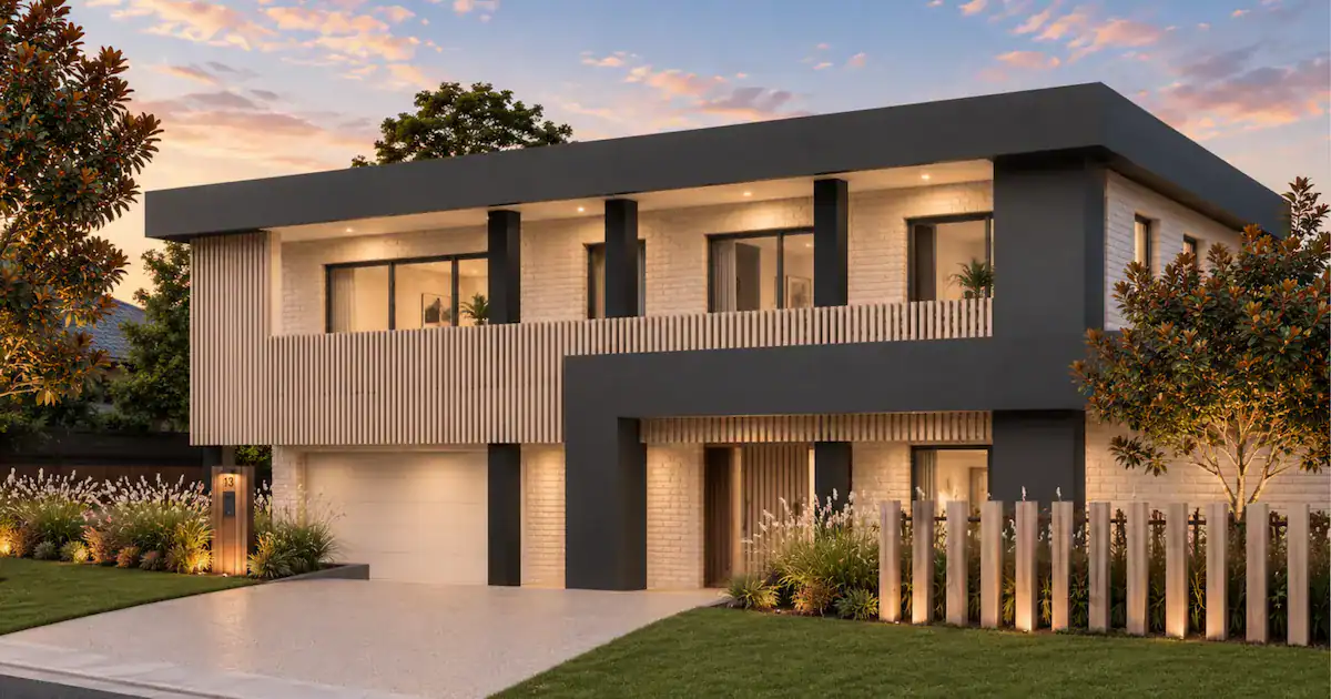
The biggest single shift was breaking the facade into distinct zones instead of treating it as one unbroken brick surface. The upper level took on a dark rendered finish, and that alone gave the roofline and top storey a sense of weight they’d never had. Suddenly it looked intentional, rather than like leftover brick that happened to keep going upward.
Vertical timber-look (aluminium) battens became the thread running through the whole design. They show up on the front door, they wrap the balcony, and they reappear again on the mailbox. Repeating a material like that across different parts of the house does something quite subtle. It tells the eye this is all one idea, not a handful of separate decisions bolted together.
The ground floor kept the lighter (existing) brick tone, which grounds the whole composition and sets up a contrast against that darker render above. That contrast is doing more work than people realise. It’s what gives the facade its sense of proportion, and it’s the reason the whole thing doesn’t read as flat anymore.
Lighting mattered more here than most people expect from a facade brief. Low garden lighting along the front bed, some warm up-lighting, ceiling lights along the balcony – and the whole composition reads differently once the sun goes down. A facade that only works in daylight is only half finished, as far as I’m concerned.
Even the fence became part of the story. A timber-look style that echoes the batten pattern on the house replaced what could easily have been an afterthought at the boundary. It’s a small decision on paper, but it’s part of why the finished result feels resolved instead of assembled.
The Outcome
What strikes me most is how the materials do the talking – through contrast and through texture.
The shape underneath hasn’t really changed. Same footprint, same proportions, same relationship between the two levels. What’s different is everything sitting on that shape, and that’s really the whole point of this project. A house doesn’t need a new outline to become a different place. It needs a design language that suits how the people living there actually want to feel walking up to their own front door, rather than whatever the house happened to look like the decade it was built.
I’m always a little cautious about the word transformation, if I’m honest about how it gets used in marketing. What I’m aiming for isn’t a dramatic before-and-after moment. It’s a result that still looks considered in another twenty years, not just striking on the day the photos get taken.
Practical Takeaways
If you’re looking at an older home and assuming its current style is locked in, it isn’t. A few things this project reinforced for me:
- Shape and style are two completely separate conversations. Don’t let one convince you the other is fixed.
- Contrast between materials, not just colour choices, is usually what creates a genuine sense of a new identity.
- Lighting deserves to be part of the brief from day one, not something tacked on once the build is underway.
A home from the sixties, or from any era really, with solid bones underneath is often a far better starting point than people give it credit for. The hard part was never the age of the house. It was working out what it actually needed to feel like itself again.
If you’re standing in front of a home that feels a bit stuck in its era and wondering whether it’s worth doing anything about, I’d love to talk it through with you. A complimentary consultation is a relaxed way to find out what’s possible before you commit to anything at all. Click on the ‘preliminary enquiry’ link below to book in a time.
Jane
📧 jane@hotspaceconsultants.com
🌐 https://hotspaceconsultants.com/preliminary-enquiry/