When homeowners start researching home facade renovation before and after inspiration, what they usually discover is plenty of colour schemes, material ideas, and beautiful finished homes.
What they don’t always see is the thinking behind the transformation.
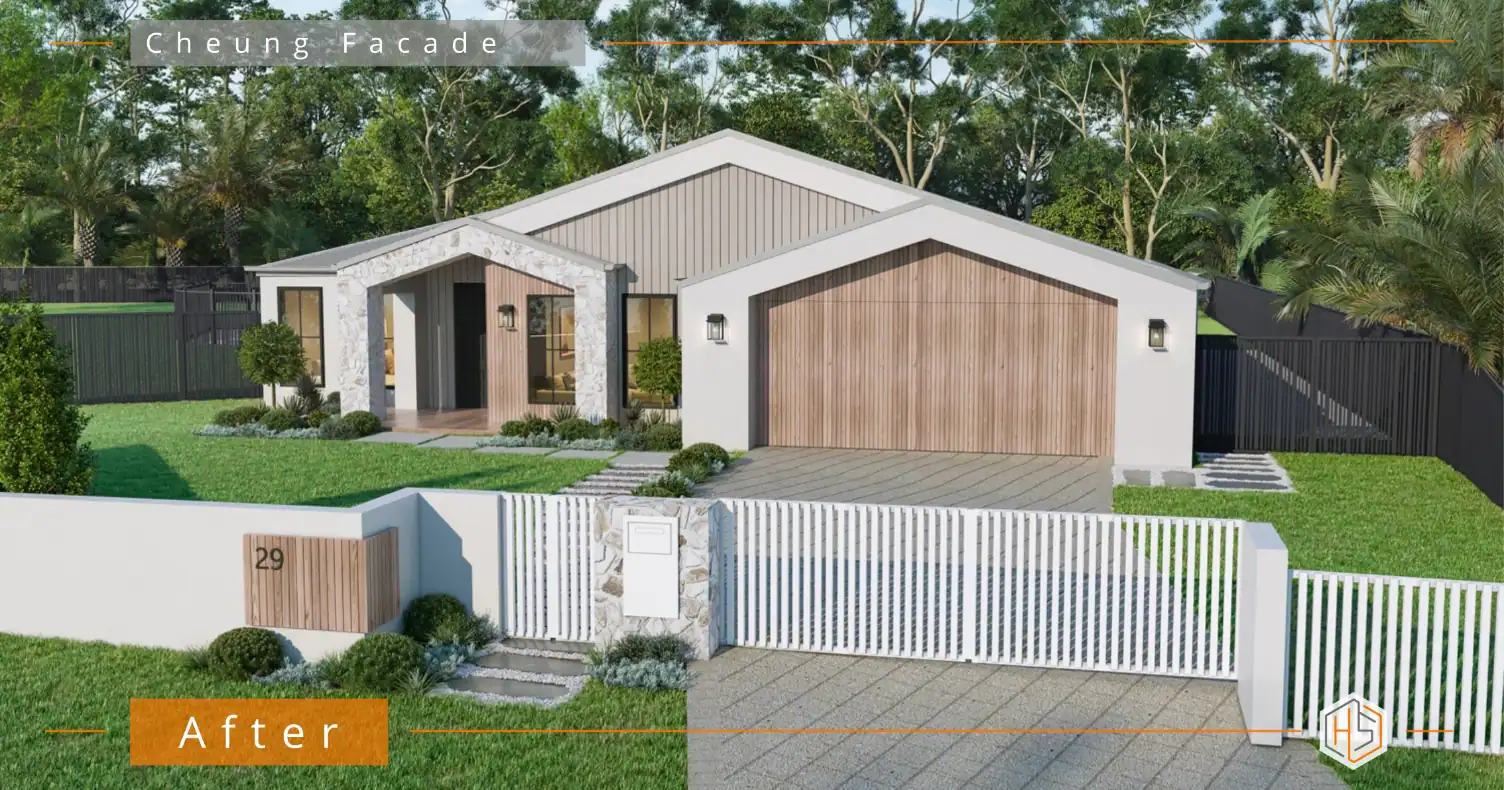
This project is a perfect example. While the finished façade looks completely different, the success of the renovation wasn’t driven by colour alone. It was the careful combination of architectural changes, material selections, and a cohesive colour palette that transformed this home from ordinary to warm, modern, and timeless.
👇👇 Designed by Hotspace 👇👇
The Starting Point
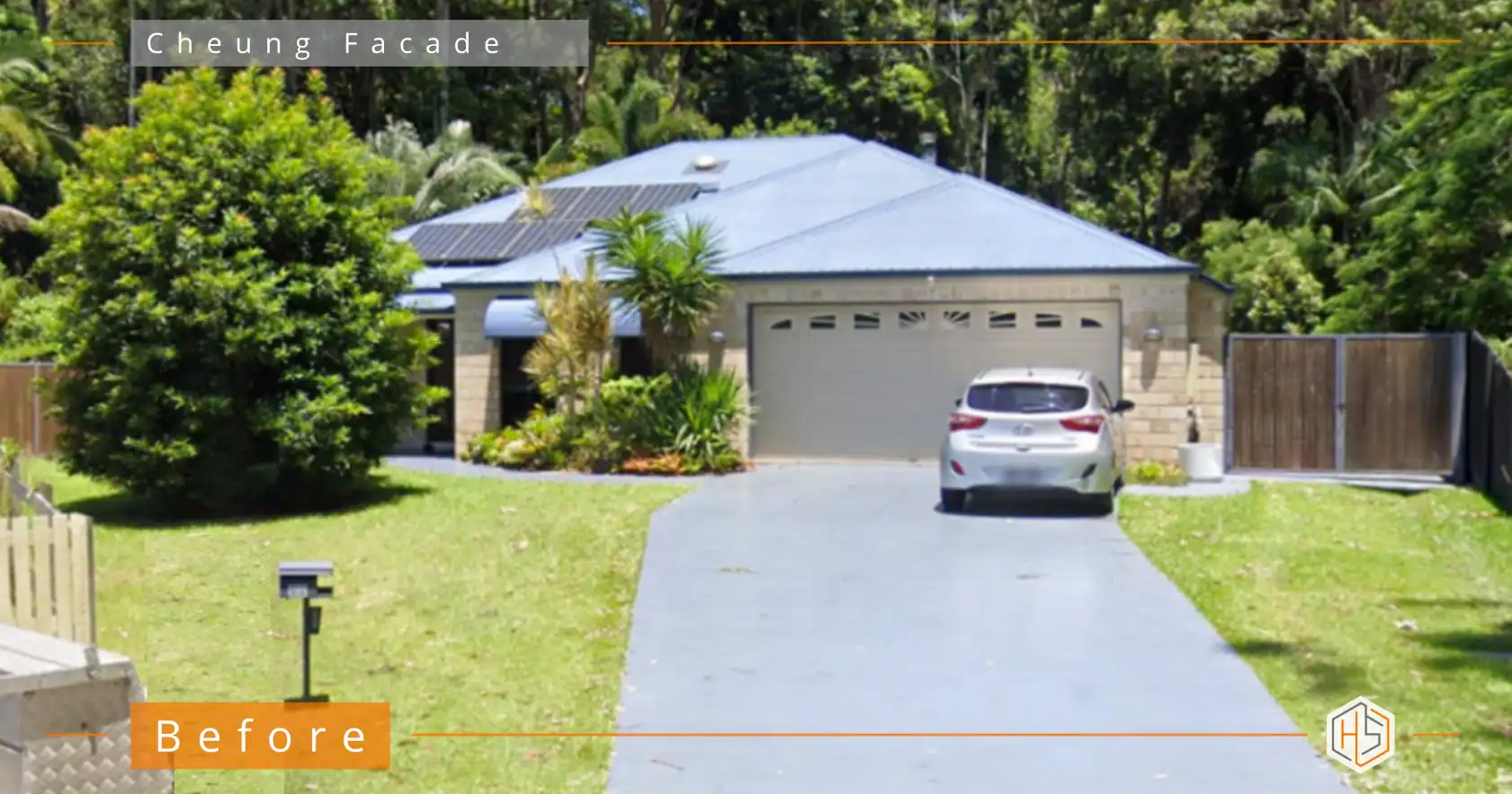
The original home was typical of many properties I see here at Hotspace.
The structure itself had good bones, but the façade lacked a clear identity. The entry was hidden, the garage dominated the front, and the combination of brick, roofing, and landscaping just all looked pretty dated.
Like many homeowners considering a house facade renovation, the owners wanted the exterior of their home to reflect the quality and care they were about to invest inside.
Why Colour Alone Was Never Going to Be Enough
One of the biggest misconceptions with a facade renovation is that selecting the right paint colour will solve everything.
However, colour can only enhance what is already there.
If the proportions are unbalanced, the entry lacks presence, or the materials compete with one another, even the most beautiful colour palette will struggle to create a cohesive result.
Before any colours were selected, I focused on improving the overall architectural composition of the home by:
- Creating a more defined entry.
- Introducing stronger visual hierarchy across the façade.
- Simplifying the material palette.
- Adding texture and depth through carefully selected finishes.
The Colour Palette That Changed Everything
The final palette combines warm timber tones, natural stone, soft whites, and subtle grey accents.
Each material was chosen to play a specific role within the overall design.
Soft White Architectural Framing
The crisp white rendered elements create clarity and rather than drawing attention to themselves, they provide structure and definition. The result feels fresh without feeling stark.
Warm Timber Features
I introduced timber-look cladding to bring warmth and softness to the design.
Without these elements, the façade would have felt too hard and modern. The timber provides balance while creating visual continuity between the entry feature and garage door.
It also helps the home feel more welcoming and connected to its natural surroundings.
Natural Stone Texture
The stone-clad entry feature became a focal point of the renovation.
Natural stone introduces texture, depth, and a sense of permanence that paint alone just can’t achieve. It creates interest without relying on bold colours and helps anchor the design visually.
Importantly, it adds character while still feeling timeless.
Subtle Grey Accents
I used muted grey tones for secondary elements to complement the warmer materials.
Rather than competing for attention, these colours provide contrast and depth, allowing the timber and stone to remain the heroes of the design.
Why This Palette Will Still Feel Relevant Years From Now
What looks fashionable today can quickly feel dated tomorrow.
Instead, I focus on creating façades that feel appropriate for the home, the homeowners, and the way they want to live.
This palette succeeds because it is built around enduring design principles:
- Natural materials that age gracefully.
- Warmth without being overpowering.
- Balanced contrast.
- Architectural simplicity.
- Cohesive material selections.
These are the elements that create longevity.
The Finished Result
This home facade renovation before and after demonstrates the power of thoughtful design decisions working together.
Not simply to create a different façade, but to create a home you’re proud to come back to every day.
📧 jane@hotspaceconsultants.com
🌐 https://hotspaceconsultants.com/preliminary-enquiry/
Jane Eyles-Bennett