As a facade designer, I’m often brought in when a home has all the right ingredients, but still doesn’t feel quite right.
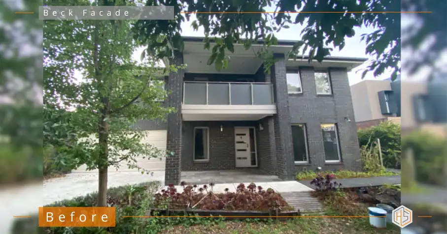
For example; this South East Melbourne project home, valued at around $2.8M, had a generous footprint, good proportions, and a strong street presence.
But despite all of that, it lacked depth and refinement.
👇👇 Designed by Hotspace 👇👇
The Brief
The clients weren’t looking for a dramatic reinvention.
They wanted a fresh, contemporary look – but importantly, they didn’t want to fall into the trap of simply rendering and painting everything white.
Their key goals were:
- Replace all facade windows and doors
- Create a more refined, contemporary exterior
- Introduce a stronger sense of design without overcomplicating it
- Maintain the existing mature trees (a non-negotiable – and rightly so)
- Add subtle landscaping elements, including planting to the balcony (still establishing)
In essence, they wanted the home to feel intentional, elevated, and cohesive. without losing its underlying simplicity.
The Challenge
The bones were good – but that can sometimes be the hardest part.
Because when a home isn’t wrong, but just not quite right, the solution isn’t about adding more… it’s about making smarter decisions.
The original facade relied heavily on:
- A single dominant material (brick)
- Minimal contrast
- Little hierarchy or focal point
Which meant the eye had nowhere to land.
The Design Approach
As a facade designer, my approach here was not to over-design, but to bring clarity, balance, and restraint.
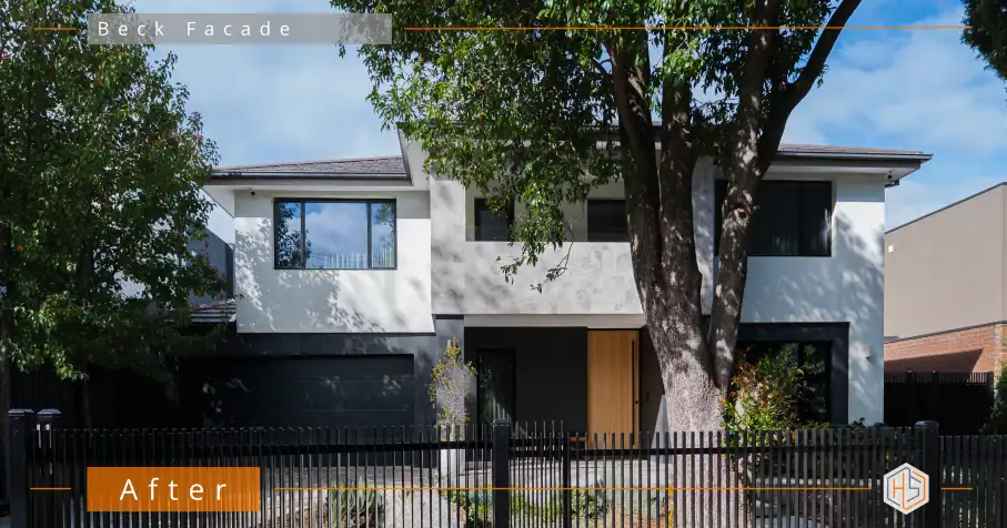
1. Colour Blocking to Create Structure
Instead of layering multiple materials, I used colour blocking to define the architecture.
This allowed us to:
- Break down the bulk of the home
- Highlight key volumes
- Create contrast without visual clutter
The lighter upper level helps the home feel more open and refined, while the darker base grounds it, giving the facade a sense of balance and permanence.
2. A Clear Focal Point
One of the biggest shifts was the front entry.
By introducing a taller, more prominent door and anchoring it within a darker recess, we created a strong focal point that draws you in.
It’s subtle – but it completely changes how the home is experienced from the street.
3. Cohesion Through Controlled Contrast
Every colour and finish was selected to work together, not compete.
- Soft, warm whites
- Charcoal and deep grey tones
- Natural timber to add warmth and contrast
Nothing is overly bold on its own, but together they create a layered, cohesive result.
4. Subtle Texture (Without Overcomplication)
Rather than relying on multiple materials, we introduced texture in a restrained way.
The central section adds just enough variation to create interest, without overwhelming the facade.
This is where many homes go wrong – adding too many finishes in an attempt to create “design”.
Here, the restraint is what makes it feel elevated.
5. Working With the Landscape, Not Against It
The existing mature trees were a major asset and keeping them was absolutely the right decision.
They:
- Soften the architecture
- Add scale and presence
- Create natural shadow and movement across the facade
The new design works with these elements, rather than trying to compete with them.
The balcony planting will further soften the upper level as it establishes, adding another layer over time.
The Result
This home hasn’t been transformed through excess.
It’s been refined through better decisions.
What was once a typical project home now feels:
- Considered
- Balanced
- Contemporary
- And quietly impressive
It’s a great example of how you don’t need to change everything. You just need to change the right things.
Thinking About Updating Your Facade?
If your home isn’t quite hitting the mark, a facade designer can help you see what’s missing – and how to resolve it.
Often, the issue isn’t the structure – it’s how everything comes together.
If you’d like a second set of eyes on your home, you can reach out here:
📧 jane@hotspaceconsultants.com
🌐 https://hotspaceconsultants.com
Jane Eyles-Bennett