This project began in a place I see quite often.
The clients had already engaged an architect and had a full set of plans. The internal layout worked beautifully. The functionality was there. But when it came to the facade… something didn’t quite sit right.
They couldn’t put their finger on it – but they knew it wasn’t finished.
That’s when they reached out to bring us in.
👇👇 Designed by Hotspace 👇👇
They were actually very clear on what they liked:
- A refined palette of materials (including light brick and off-form concrete tones)
- Bronze anodised window frames
- A flush panel garage door with a vertical timber look
- A secure, gated frontage with a distinctive entry experience
- A modern, slightly desert-inspired landscape
But what they didn’t have was a way to pull it all together into a cohesive, resolved design – or the ability to clearly visualise the outcome beyond CAD drawings.
The Challenge
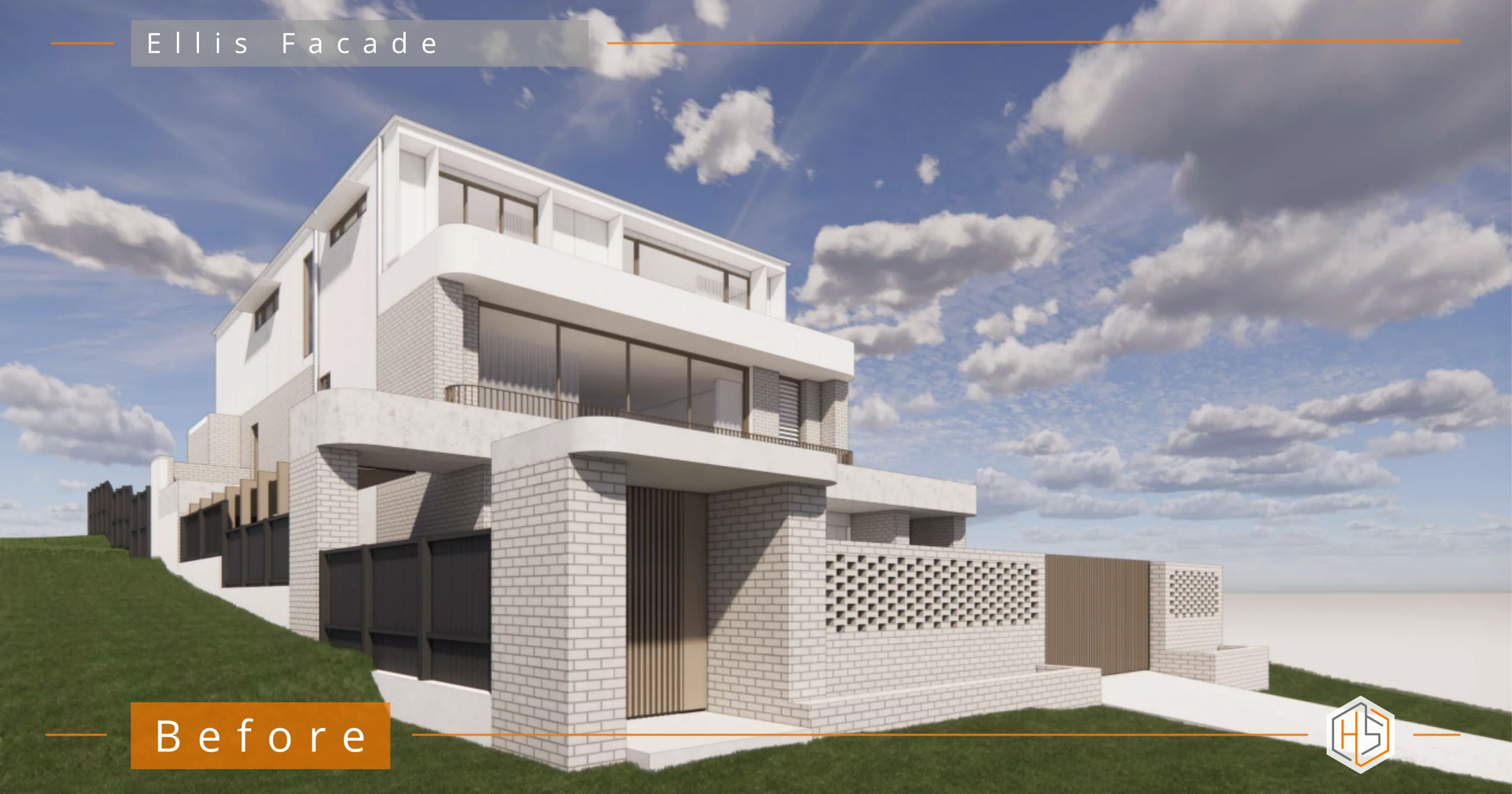
The existing facade concept had good intentions, but it lacked hierarchy and resolution.
There were a few key issues:
- Too many competing curved elements, without restraint
- Planter boxes that were oversized (1.5m deep) and structurally heavy
- Windows that stopped short of the ceiling, disrupting the vertical proportions
- Non-compliant balustrade design – an important safety concern given the clients have young children
- A gatehouse that didn’t feel considered or unique within the streetscape
- A general lack of flow between the street entry, the home, and the interior experience
The result? A design that felt close, but not quite what they were after.
The Design Approach
My role here wasn’t to redesign the home – it was to refine, edit and elevate what was already there.
To take a good foundation and turn it into something that felt intentional, balanced, and complete.
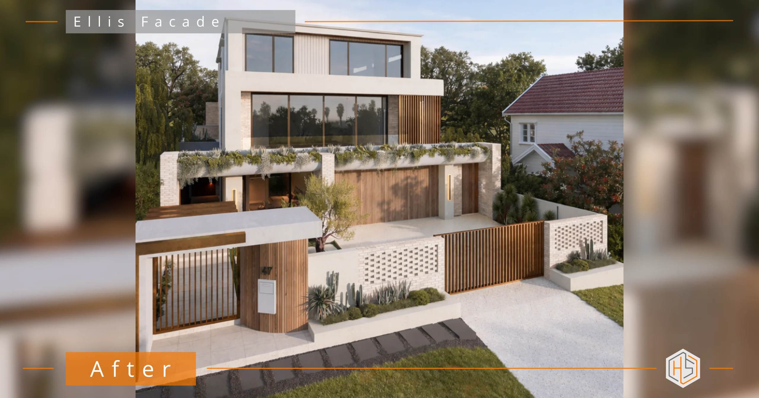
Creating a Clear Hierarchy
One of the biggest shifts was introducing a stronger sense of visual hierarchy.
The focus was deliberately placed on the ground and middle levels, where the interaction with the street happens. These levels now carry the weight of the design – through materiality, detailing and structure.
The upper level was simplified. Still interesting, but intentionally quieter. It supports the design rather than competing with it.
Refining the Material Palette
The clients already had excellent instincts with materials.
My job was to edit and balance, not add more.
- Light brick and off-form concrete tones create a soft, architectural base (as outlined in the material schedule )
- Bronze anodised joinery adds depth and warmth
- Vertical timber elements introduce rhythm and contrast
Rather than overcomplicating the palette, the focus was on repetition and placement, ensuring each material had a purpose.
Reworking Key Architectural Elements
Windows
The windows were redesigned to extend fully to the ceiling line. This simple move dramatically improved the proportions and brought a more architectural feel to the facade.
Planter Boxes
The original 1.5m deep concrete planters were reduced to approximately 700mm deep.
This achieved three things:
- Reduced structural complexity
- Lightened the visual weight
- Maintained the design intent without overbuilding
Balustrades
A compliant, integrated balustrade solution was introduced—designed to feel seamless rather than added on. This was especially important for safety, without compromising aesthetics.
The Gatehouse & Entry Experience
This was a key moment in the project.
The clients wanted a gatehouse, but not one that felt like a repeat of others in the street.
The solution was to create a layered entry sequence:
- A defined gatehouse with strong vertical detailing
- A controlled, secure frontage with integrated access
- A clear visual and physical transition from street → entry → home
This creates not just security but a sense of arrival.
Introducing Restraint with Curves
The original design leaned quite heavily into curves.
Rather than removing them completely, I refined and reduced their use keeping them where they added softness and contrast, but eliminating where they created noise.
The result is a more sophisticated balance between:
- Linear structure
- Subtle curvature
Privacy Without Compromise
A standout moment in the design is the curved screen to the pantry window.
This solved a practical issue; privacy to a street-facing space, while becoming a feature element in its own right.
It’s a good example of where function and design meet seamlessly.
A Cohesive Journey
One of the client’s key goals was flow – from the gatehouse, through the entry, and into the home.
Every decision was made with this in mind.
Materials, lines, and forms are repeated and aligned so that the experience feels connected – not disjointed.
The Outcome
The final design feels calm, confident and resolved.
It takes everything the client already loved – the materials, the palette, the overall direction… and brings it together into something that feels intentional and complete.
Most importantly:
- The facade now reflects the quality of the home internally
- The design is buildable, practical and considered
- The clients can clearly visualise the outcome through detailed colour illustration
- And the home has a strong, distinctive presence in the street
A Final Note
This project is a perfect example of something I see often:
You don’t always need to start again.
Sometimes, the right move is to refine what’s already there – to bring clarity, balance and direction to a design that just needs resolving.
If you’re building a new home or considering a facade renovation and want to make sure you get it right first time, start with a design plan from Hotspace.
Send me some photos via email or the link below and I’ll be in touch… 📧 jane@hotspaceconsultants.com