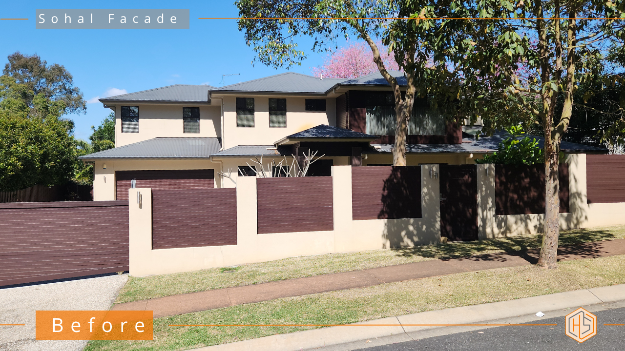
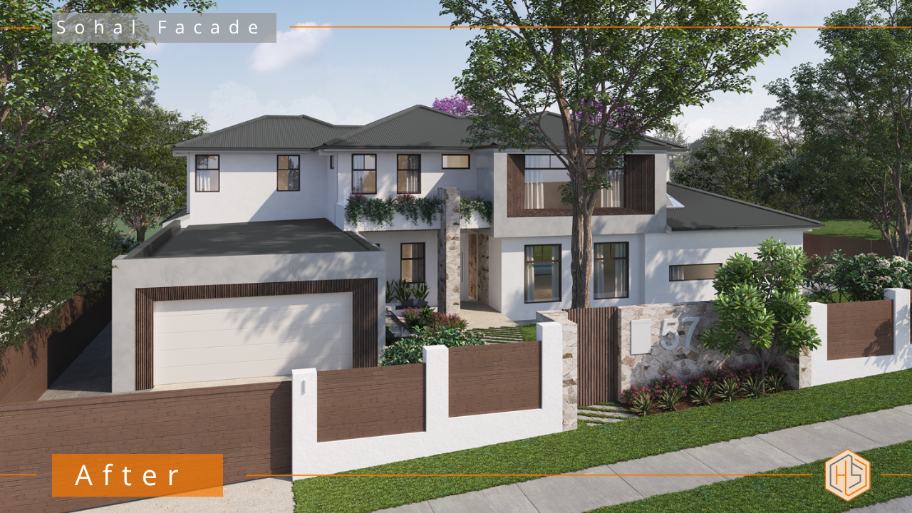
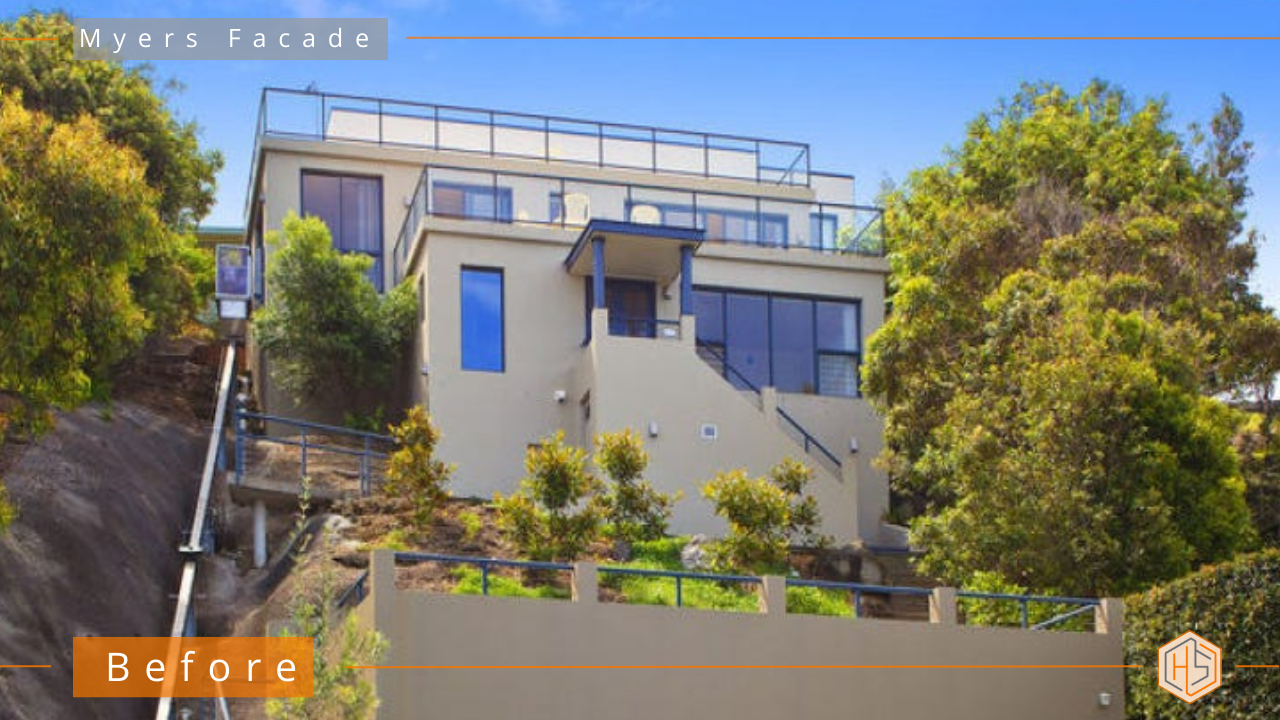
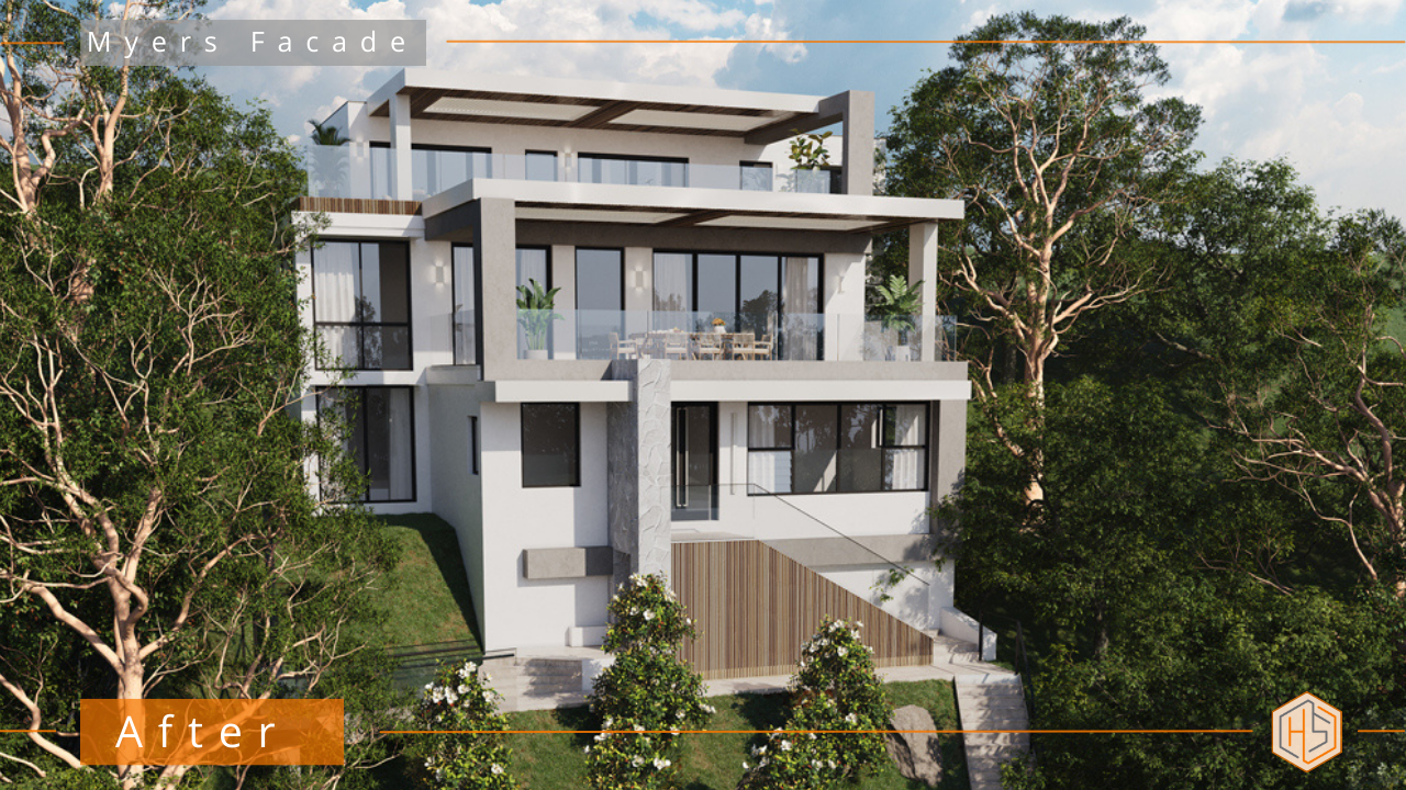
Renovation is rarely about gutting everything and starting from scratch. Most of the time, you’re working with some of what you’ve already got – especially if it’s still in good condition or out of your budget to change for the time being. Constraints happen on every single project – regardless of budget (yes, even on multi-million dollar new-builds!) – but that’s actually when the magic can happen. Take a look at our gallery for creative examples of how existing colours, finishes, and awkward features can be reimagined into cohesive, considered design details.
1. Lean into what you can’t change
Sometimes, the best design outcome happens because of limitations. Maybe you’ve got brown window frames, dated feature cladding or a too-high front fence (or any number of things) — and just simply don’t want to replace them at the moment. Instead of fighting them, lean in.
*Choose new materials and colours that work with, not against, the existing tones
*Balance warm undertones with complementary neutrals or soft charcoals
*Repeat that colour subtly elsewhere so it feels intentional, not leftover
When your new design embraces those “unchangeables,” the end result looks cohesive and confident – like it was always meant to be that way.
👇👇Designed by Hotspace👇👇
2. Overshadow the undesirable features with stronger highlights
When you can’t hide something, distract the eye with something better. By introducing bolder, high-impact design features, you shift attention away from what’s not ideal.
*Add a striking focal point – like a recessed gate entry or feature stonework
*Use strong textures or layered materials to create visual interest and depth
*Highlight one hero element so the less-desirable colours fade into the background
It’s a clever design trick: when the eye has something more interesting to land on, the older or mismatched features simply stop standing out.
3. Keep it mindful — not manic
When blending old with new, restraint is key. Too many competing materials or colours can create chaos instead of cohesion.
*Stick to two to three main colours or materials
*Ensure each new addition feels like it belongs in the same design family
*Avoid adding every idea you love – the strongest facades are usually the simplest
Mindful design choices make your renovation feel balanced and refined, not overworked. The goal is cohesion, not confusion.
4. Get expert guidance for a cohesive result
Even with clear ideas, it’s easy to second-guess your colour combinations or wonder if you’ve gone too far (or not far enough). A professional eye can help you pull everything together seamlessly, so your “part-new, part-old” home feels intentional and beautiful.
With a professionally developed Facade Design Plan from Hotspace, you’ll have:
*visually mapped-out design tailored to your home
*Colour and material selections that harmonise perfectly
*Expert guidance to make existing features look purposeful
*Confidence to brief tradies without costly trial-and-error
A great renovation isn’t about perfection – it’s about clever, considered choices that completely transform your home.
If you’d like help blending your existing colours and features into a design that feels new, cohesive, and elevated, get in touch here:
https://hotspaceconsultants.com/preliminary-enquiry/ or email me some photos of your home directly to me at jane@hotspaceconsultants.com
Jane
Renovating your facade isn’t just about a splash of paint or a new door – it’s the meticulous attention to detail that elevates everything. If you’ve been scrolling the internet for rendered house ideas, I hope this article helps you! Creating a magazine-worthy exterior means thinking beyond the basics – right down to every finish, line and transition. Want some inspiration? Check out the gallery for some of the transformations I’ve help my clients achieve.
1. Rendered house ideas: Why details matter
Details are what separate eye-catching facades from those that fade into the background. When you look at homes with beautiful rendered exteriors, what stands out? It’s the careful planning – the consistent lines, crisp junctions, and subtle contrasts that make you stop and stare.
- Shaped mouldings or shadow lines create visual layers
- Texture changes – smooth render, concrete look – materials that bring richness
- Even the way render wraps around windows and doors can add sophistication
Miss these elements, and your facade can fall flat – no wow-factor, no personality.
Designed by Hotspace
👇👇
👇👇
2. How material combinations lift rendered house ideas
Pulling together rendered house ideas isn’t just about choosing a neutral shade of paint. It’s about how you combine materials to add depth, warmth and visual appeal. Blend rendered surfaces with other finishes and your home instantly stands out.
- Timber detail (think natural battens or a modern, stained portico)
- Vertical cladding for interest
- Contrasting smooth and rough textures
- Subtle use of stone for understated luxury
You should always consider how materials meet – crisp intersections make exteriors look finished rather than rushed. For more insight, see how we approach facade renovations.
3. Contemporary colour schemes for rendered house facades
Contemporary facades need timeless colour schemes – nothing garish or over the top. With rendered house ideas, neutrals are your greatest asset.
- Whites, off-whites, greys and charcoals always feel fresh
- Timber highlights pop against a neutral background
- Layers of light and shade give energy to the finished facade
Stick to whites or greys for the body of your render. Bring in black, Sho Sugi Ban, dark or mid toned timbers, and watch your home pop.
4. Design touches that make rendered exteriors pop
The right finishing touches can transform your rendered home from blah and boring to custom. Consider how these elements can amplify your facade’s street appeal:
- Linear lighting features or wall washers
- Custom fascias or vertical battens as subtle architectural highlights
- Slimline slatted screens for privacy and interest
- The right hardware and landscaping to further enhance your chosen style
All your choices send a message. Do you want contemporary calm, striking sophistication or country comfort? The right details bring your vision to life.
5. Professional guidance for rendered house ideas
You’ve seen it – homes with uncoordinated exteriors, clashing finishes and costly mistakes. Where the finished look just doesn’t work. Many homeowners underestimate how complex it is to pull together perfectly rendered house ideas.
A seasoned exterior design consultant helps you:
- Balance materials, finishes and colours with confidence
- Avoid disconnects between your vision and the finished result
- Provide tradies with clear plans so they understand what you want
- Eliminate the overwhelm – no second guessing or costly do-overs
Ready to see how an expert can turn concept into kerb appeal? You can get in touch me via the link below or by emailing some photos of your home to jane@hotspaceconsultants.com
Jane https://hotspaceconsultants.com/preliminary-enquiry/
Building a house from scratch should be exciting. But for so many, new home design ideas quickly become a headache – working with an architect or draftsperson who doesn't 'get' your vision, confusing plans, and the very real fear that your home won't end up looking anything like you want.
And that's exactly why engaging a facade specialist (like Hotspace) changes everything. You want a home that stands out, oozes kerb appeal, and feels entirely yours. It's all about design direction – personalised for you. See some real-world new build transformations in our gallery.
1. A beautiful exterior starts with a facade specialist
Those stunning new home design ideas you collected? They need a pro's eye to actually work on your new home, with your budget, for your taste. That's what a facade specialist does; translates inspiration into reality with:
- Skills to interpret and elevate your vision
- Layering of materials like rendered surfaces, timber accents, stone features walls or interesting cladding combinations.
- Sophisticated colour schemes – neutral but not boring
- An understanding of architectural features that maximise street appeal
2. Avoiding the cookie-cutter trap with new home design ideas
It's easy to end up with a generic new home. Most builders offer a basic palette – pick a brick, choose a roof, done. But genuine street presence takes far more:
- Customised design treatments for cladding, windows, and entryways
- Smart use of texture and contrast to break up flat, boxy forms
- Clever details like oversized eaves, feature walls or shadow-lines to add depth
- Cohesive material integration for a polished finish
3. Translating new build dreams into real kerb appeal
Dreaming up new home design ideas is easy – pinning inspiration boards, making mood collages, the works. But cohesive kerb appeal? That's a technical process. A facade specialist walks you through:
- Harmonising your home's shape, block position, and street context
- Choosing the right materials that look good – and last
- Selecting colours and finishes that highlight, not fight, your home's form
- Creating a modern yet timeless look that avoids fads
This expertise is invaluable, especially when you're investing substantial sums into your new home. Learn more about our new build facade service right here.
4. Saving you from costly missteps with your new home
Building a new house is never "just picking colours." (Most owners find that out the hard way.) A facade specialist saves you from the expensive, irreversible errors that come with:
- Mismatched claddings, bricks, or tile selections
- Poorly chosen proportions or underwhelming entry features
- Lack of architectural layering leading to a flat, bland facade
- Finishes that date quickly or age badly
5. The confidence and clarity to create your dream home
Too many new home design ideas get lost in translation when dealing with tradies and builders. Working with a facade specialist gives you:
- Clear, detailed documentation – all tradies know exactly what to do
- Trusted material and finish recommendations
- Guidance that ties your whole vision together (no more analysis paralysis)
- Peace of mind that every dollar spent will deliver genuine, visible impact
The end result? A home with undeniable personality and lasting value; one that turns heads for the right reasons.
If you're going round in circles with your current designer/draftsperson and feel like a happy resolution is nowhere in sight, send me your plans and a few inspiration photos to jane@hotspaceconsultants.com or get in touch via the link below.
Jane https://hotspaceconsultants.com/preliminary-enquiry/
Renovating your brick house using the right colours, materials, products and details will give you timeless appeal, increased value, and if you want it – make your home the standout on the street. I’m not talking about another cookie-cutter renovation where you render the walls, paint it a lovely colour and update the landscaping… If you want to truly transform your home, you’ll have to do much more than that (take a look at the many brick home transformations in my before & after gallery for proof!).
1. Add depth and impact with texture and contrast
If you simply render and paint over your brick, your home will appear flat and lifeless. Incorporating the right textures, cladding, materials and lighting is paramount.
- Mix in softer textures – think smooth rendered walls beside more textured elements
- Opt for vertical timber cladding to break up large expanses
- Add deep reveals and painted eaves – more architectural layers and more wow-factor
👇Designed by Hotspace👇
2. Elevate your brick house renovation with a timeless colour scheme
Choosing colours can be overwhelming, but the best results come from restraint.
- Stick to 1-2 main exterior colours, plus 1-2 accent materials (total of 3-4)
- Use subtle contrasts – Neutrals, always. Mix whites, off-whites, charcoal, very light beige, perhaps very light pastels – clean and elegant every time.
- Avoid complex colour palettes; simplicity is key in classic design
3. Details that define street appeal and bring it all together
The right finishing touches turn a generic brick house into a classic, head-turning home.
- Select classic, understated house numbers and lighting – matte black, gold or brushed steel
- Use simple landscaping to draw attention to the refreshed facade, not the garden beds
- Add architectural interest with new fencing or low retaining walls that echo your facade’s material palette
4. Invest in a cohesive design process for your brick house renovation
If you’re serious about results, invest in the planning stage. Brick house renovations demand more than “just picking colours” – they need a vision brought to life.
- Engage an exterior consultant like Hotspace for bespoke design (so you don’t end up with a costly do-over)
- Demand a detailed design and a clear material schedule
- Expect a renovation investment from $70,000 to $200,000+ because quality transformations carry real impact and value
If you really want to turn your tired brick facade into a classic hero, get in touch via the link below or email me some photos at jane@hotspaceconsultants.com.
Jane https://hotspaceconsultants.com/preliminary-enquiry/
If you’re about to update a two-storey home and tossing around balcony renovation ideas, you’ve probably already realised it’s not as simple as choosing a new balustrade and floor tile. The right design can make your balcony the feature that transforms your entire facade – in a way that adds style, liveability, and serious kerb appeal all at once.
However, most people stop at surface-level updates. A quick paint job or a swap of railings might freshen things up for a season, but it won’t deliver that “wow” factor.
Done well, your balcony will instantly elevate your street presence, provide valuable outdoor living space, and tie your whole facade together so it feels cohesive and intentional. The great thing is that you don’t have to compromise on style to make it functional (or vice versa). With the right design strategy, you can absolutely have both.
👇Designed By Hotspace👇
1. Balcony renovation ideas that maximise kerb appeal
Balconies sit front and centre on a two-storey facade, which means they have the power to completely change your home’s first impression. A carefully chosen colour palette creates a timeless base that feels fresh year after year. Pairing this with sleek balustrades, modern glass railings, or even a warmer timber-look decking or detailing instantly lifts the feel of the whole house. Add depth with rendered finishes, vertical cladding or feature panelling, and suddenly your balcony isn’t just a functional platform – it’s a design statement that commands attention from the street.
The smartest balcony renovations don’t just look good; they add true functionality you’ll enjoy every day. By thoughtfully expanding the footprint, you can create a space that feels like a natural extension of your living areas – perfect for coffee in the morning, weekend entertaining, or simply soaking in the view. Incorporating an overhead cover (think Vergola or Louvretec) means you can use the balcony rain or shine, while clever privacy screening keeps the space comfortable without blocking natural light. Done right, a balcony becomes a destination within your home, not just something to look out onto.
3. Low-maintenance balcony renovation ideas
Style only gets you so far if your balcony constantly demands upkeep, so your material choices matter. Composite or engineered timber alternatives deliver the warmth of wood without the endless cycle of sanding and re-oiling. Powder-coated metal or minimalist glass railings keep things streamlined and easy to clean, while lighter-toned surfaces disguise dirt so your balcony looks fresh with minimal effort.
For inspiration that goes well beyond balconies, take a look at our gallery of before and after images
4. Cohesion: tying your balcony renovation into the whole facade
Perhaps the biggest mistake homeowners make is updating a balcony in isolation. Without a broader vision, the balcony risks looking like an afterthought. The real magic happens when the balcony design is tied into the entire facade. Repeating colours, textures, or architectural elements across the entry, eaves, and balcony makes the whole house feel unified and intentional. Lines and forms should complement each other so nothing appears bolted on at the last minute. It’s this cohesion that’ll transform your home rather than just update it.
If you’re stuck for ideas, second-guessing your decisions, or just ready to take your home from dated to dazzling (balcony or not!), I’d love to help. Email me some photos to jane@hotspaceconsultants.com or get in touch via the link below to see if we can help.
Jane https://hotspaceconsultants.com/preliminary-enquiry/
Building a new home from scratch? Getting the house colours right on your exterior is non-negotiable. If you want true kerb appeal – not a cookie-cutter approach – you need a cohesive, thoughtfully-chosen colour scheme that sets your home apart. Head to the gallery if you’re looking for ideas…
1. Why house colours set the tone for your new build
If you drive down any street of new builds, you’ll spot it straight away. Homes that stand out have clear vision from the get-go – especially when it comes to house colours.
- The right neutral tones create a feeling of sophistication, warmth, and modernity
- Cohesive colour schemes boost both street appeal and long-term resale value
- Bold contrasts with whites, greys, or deep charcoals provide eye-catching depth
👇Designed by Hotspace👇
2. Creating impact with house colours
House colours aren’t just ‘paint on a wall.’ Every material choice plays with light, highlights textures, and works with your home’s angles.
- Stone cladding accents gives homes a more luxury look
- Charcoal or black doors and trims add definition and sharpness
- Timber cladding or accents introduce warmth and instant personality
- Rendered finishes, when paired with the right neutrals, create a timeless, upmarket statement
3. Avoiding common mistakes when selecting house colours
You wouldn’t pick bathroom tiles without seeing them in the space. Same goes for house colours – context is everything. Unfortunately, so many new builds miss the mark because the (inexperienced) owners are left to choose the colour scheme.
- Trying to match bricks, roof, and cladding by eye (big mistake)
- Overdoing one tone – creates a flat, lifeless effect
- Ignoring the architectural lines and proportions
- Using trending instead of timeless colours (remember, neutrals never go out of style)
4. Adding dimension with materials and visual layers
A solid house colour scheme isn’t just about the paint. It’s about layers; visual interest, achieved through smart use of different materials:
- Vertical cladding to break up boxy shapes
- Feature timber panels for warmth against rendered façades
- Subtle textural render contrasts (like smooth next to bagged finishes)
- Shadow lines and deep reveals painted in matte charcoal for architectural drama
5. House colours for maximum kerb appeal
House colours are the first thing anyone notices. And if you want that ‘wow-factor’, you need synergy between the roof, cladding, trims, and entry.
- Consistent colour palette from the facade through to the garage and front door
- Timber hues that tie in with landscaping or fencing for a seamless look
- Subdued neutrals that still highlight standout architectural features
If you’re designing a new build, don’t leave these critical decisions to the last minute – discover more about new home facade transformations here: https://hotspaceconsultants.com/new-build-extensions-facade-design/ and get in touch if you’re feeling out of your depth.
Jane
https://hotspaceconsultants.com/preliminary-enquiry/