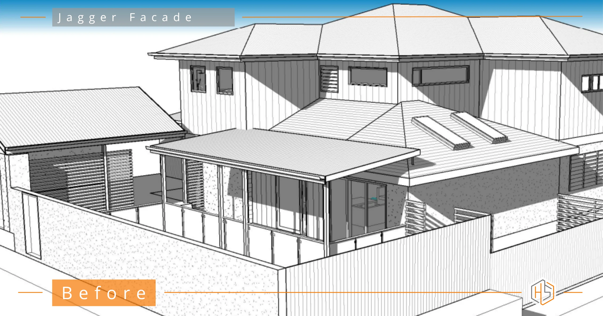
This exterior renovation project didn’t begin from scratch.
The clients had already worked closely with a building designer and had invested a lot of time getting the internal layout right. And it showed – the bones of the home were solid.
But the exterior? It just wasn’t landing for them.
They knew it wasn’t quite what they wanted, but couldn’t clearly articulate why. So while the house worked, it didn’t yet feel like them.
👇👇 Designed by Hotspace 👇👇
Finding the Style
Before jumping into the exterior renovation design with this client, we slowed things down.
I asked a lot of questions – about what they were drawn to, what they didn’t like, how they wanted the home to feel. From there, they created a Pinterest board.
That’s where things clicked.
A clear direction started to emerge:
- Strong, modern forms
- A darker, more grounded palette
- The warmth of timber to balance it
- Texture through stone
- A home that felt bold, but still inviting
The Challenge
The challenge here wasn’t to redesign everything – it was to work with what was already there and elevate it.
Key constraints included:
- Much of the roofline needed to remain (with only subtle tweaks)
- Existing white windows were to be retained
- Gates and screening elements to the side of the garage needed to stay
- An existing poolside pavilion the clients initially wanted to keep
And then there was the biggest challenge of all:
👉 Bringing all of this together into a cohesive, resolved facade.
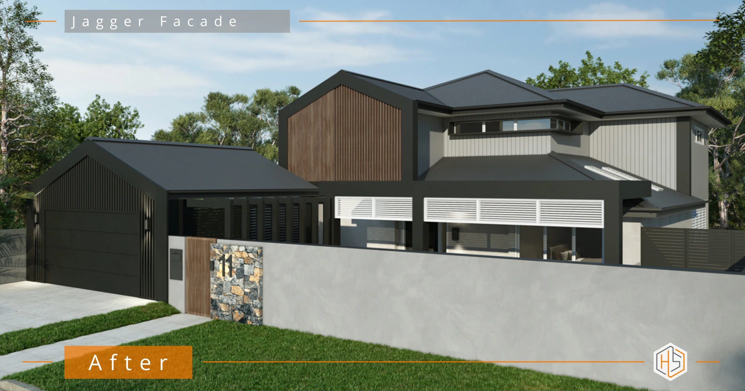
The Design Approach
This was about introducing a clear, confident design direction – and then applying it consistently across every element.
A Stronger Architectural Identity
The updated facade leans into a darker, more contemporary palette:
- Black and charcoal tones ground the home
- Vertical light grey cladding adds contrast and height
- Timber introduces warmth and softness
- Feature stone creates texture and a focal point
Rather than competing, each material now has a clear role.
The Garage & Street Presence
The clients were clear on one thing:
👉 They wanted the garage to be bold.
We leaned into this with an all-black garage door, allowing it to become part of the overall composition rather than something to disguise.
Paired with the darker palette, it helps anchor the entire facade.
Making the Hard Call
The clients originally wanted to keep the existing poolside pavilion.
But sometimes, part of my role is to say:
👉 “This isn’t going to work.”
It didn’t align with the new direction, and keeping it would have diluted the overall result.
So we redesigned it.
The new pavilion now complements the home – rather than feeling like it really didn’t fit.
Bringing It All Together
What makes this project work isn’t any one element – it’s how everything connects.
- Materials are repeated and balanced
- Colours are intentional and restrained
- Forms are simplified and strengthened
- Old and new elements are unified
The Outcome
The final design feels bold, cohesive and completely resolved.
- The exterior now reflects the quality of the interior
- The home has a strong, confident street presence
- Every element feels considered – not accidental
- And most importantly, it feels like them
A Final Thought
This exterior renovation project is a great reminder:
You don’t always need to start again.
Sometimes, the house is already doing a lot right.
It just needs someone to step in, clarify the direction, and pull it all together.
If you’re working with plans that feel “almost there” but not quite right, that’s exactly where I come in.
Send through your plans or photos, and let’s see what’s possible… 📧 jane@hotspaceconsultants.com